Purified

Purified

TPF Noob!
Joined
Dec 27, 2004
Messages
24
Reaction score
0
Location
Minnesota, USA
Website
purified.smugmug.com
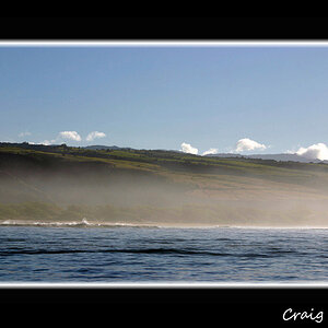
I'm wondering how the picture comes across... I was trying to do a theme that matched my username, purified. If there is anything I could do to improve please make some suggestions... this is my 3rd day of experience with a good camera.

yeah...-006.jpg
 
nice capture! pearl necklace really adds to the shot.
 
tho i must say it looks like she is wearing a earring and i think it would look even better if we could see all of the earring. it would add a little more..

still a great pic tho ;)
 
DIRT said:
An awsome shot... i really like it. i think it looks a tad on the green side. maybey shift it towards blue a bit. but i dont know, a great shot!

To counter the green, shift it toward magenta. Blue counters yellow.
Unless you're looking for an overall blueish-green hue, then go ahead and shift toward blue. But for me, when i think "Purified" i think clean whites and crips blues - green... not so much.
 
The hair covering the eyes, the uplifted head, the frozen droplets all work great. I would also like to see a slight color adjustment to neutralize that as a consideration in the photo - what I see is a definite cyan cast that can be slightly cooled off by adding a bit of red. Then, if there is any green left, add some magenta to "clean" the color cast a bit. Also, I would consider burning in the cheek area a little.

Nice shot.

Tuna
 
I like the green tone. I'd say keep it. The shot struck me as a picture I immediately liked and didn't want changed. Nice work.
 

Most reactions

Back
Top