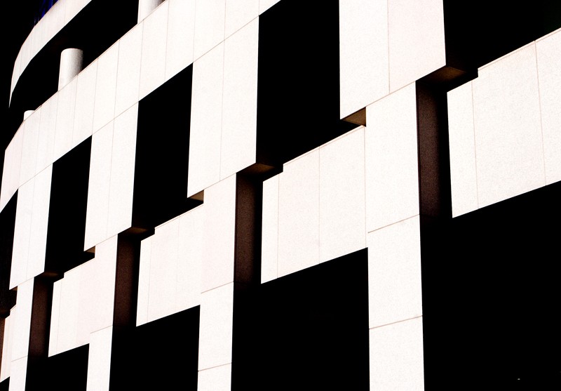
sorry ken, not really seeing it. If you shot the entire bridge i would see it. If you shot it as a straight abstract and brought out the lines, textures, some symmetry or something i would see it. These seems somewhere in between in a awkward place. jmo. Maybe if it was a bw bringin out the details, but it would still be a little weak.
firstly .... title was "railway bridge"
then I opened the thread and saw .... "huh, what ?" I didn't see a railway bridge. It took me a bit to see it. You knew what you took a photo of but the title threw us off and made us think too much of how the photo was correlated to the title.
After that, then what Brian said plus B&W possibly.
I would have to agree with the others. While I find the wood grain in the cement to be cool there just is not enough of the structure there. From what I can see it could be a building a road bridge or any other cement structure.
I think it has great potential. Even out the tone so there's no shadow at the top or the underside. Even the tone further by darkening the front of the arch. Then convert to B&W and lean hard on the contrast.
I agree with whoever said the title threw people off, I know it did for me. I think this would work best in black and white. I'd also be tempted to crop down from the top a bit, say about midway of that first concrete block and crop up from the bottom about midway of the last concrete block. To me that would make it a stronger image of angles and shapes and the black and white I feel would definitely set off the textures much better.
Thanks for the additional comments. I processed a different image, which had more of the underside of the arch and less above, which seemed more interesting to me. I also boosted the contrast in the conversion and a little bit selectively in PS and converted to B&W. I normally don't push contrast this much, but I think it does work here. Thanks for the suggestions!
As for the title, that was just a default, as I didn't have anything better.
I think it has great potential. Even out the tone so there's no shadow at the top or the underside. Even the tone further by darkening the front of the arch. Then convert to B&W and lean hard on the contrast.
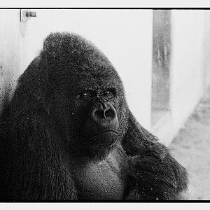
I like the B&W much better. On my monitor I'd even go just a tad more with the contrast. You'll lose some detail by upping the contrast but gain in boldness. You want to show/demonstrate/project strength ... the unmovable object.

")

![[No title]](/data/xfmg/thumbnail/35/35948-700e0d840da0ca73727b1bd6d99b4142.jpg?1619737257)
![[No title]](/data/xfmg/thumbnail/37/37621-b86590cf53fc4001d12701ee3091029b.jpg?1619738152)

![[No title]](/data/xfmg/thumbnail/35/35947-ab35bfc67d8e12ce65dda301d3bf2b66.jpg?1619737255)