Re branding myself - Logo / business card critique for 16 year old photographer

JeremyD

No longer a newbie, moving up!
Joined
Jan 9, 2013
Messages
108
Reaction score
36
Location
Canada
Can others edit my Photos
Photos OK to edit
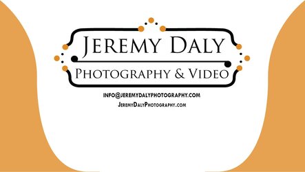
Greetings TPF, I am a 16 year old photographer in the mist of re branding my photography / video business. I've created a new logo and business card and would love the valuable opinions the community has to offer. I am about to begin second shooting for weddings and I shoot for events, bands, sports, and for my free time nature, night photography, time laspes etc etc.

The new logo:

Jeremy-Photo-Logo-1283 by Jeremy Daly Photography, on Flickr
The business card:

TPF by Jeremy Daly Photography, on Flickr

These graphics were created in Adobe Illustrator, from scratch and not copied from any other designs ( I drew it before I created it on the computer )

Any opinions on the logo design, or the appearance on the business card would be greatly appreciated ! I am here to learn so any feedback negative or positive is welcomed

Many thanks,
Jeremy.
 
On your business card it spells 'JEW' down the left side...
 
I don't feel there's any need to notify everyone which is the email and which is the website, especially with just single, large letters. Anyone who doesn't know what those two things are, likely wouldn't know how to contact you via those mediums anyways.

It would be much more prudent if it were a phone and fax number, to differentiate.

Also, I feel like it would look better overall if your name was centered, and the email and web address were dropped down a line or two, and possibly a slightly smaller font was used. I would also look into using the same font for the entire card, instead of times new roman plus whatever you used for the logo.
 
I would also say that you should get rid of the E and W. Make it all the same font and center the name, email, and website.
 
What does all that graphic stuff mean?

It is very busy. I mean, if that's your logo then go with it...but the "fancy stuff" at the sides and top draw my eyes away from your business name in the center.
 
Honestly, I don't mind the "busy stuff" around your logo. Overall your logo is not bad at all. It's clean and looks relatively professional.

The business card however is another story. As has already been pointed out, your simplification of email and website have created the word "JEW" going down. That should be changed.

I hope you don't mind, I did a quick rendition of, in my opinion, a cleaner business card for you.

$9768159023_ca3f3c3a6b_o.jpg

I chose to exclude your name in the white area of the business card, because it seems rather counter productive to say it twice; once in your logo and then again underneath. It is quite obvious what your name is already from the logo. That is unless you are going to be hiring other photographers to shoot under your businesses' name. Then by all means include their name on the card. But I dont think it is necessary for you to do so.
Your original card was lacking a distinct focus point, everything was roughly the same size, so the viewers eye did not know where to go... I simply subordinated your contact details so that your logo is the focus point of the card and then when they want to know how to contact you they can read the smaller contact details.
 
16 year photographer or 16 year old photographer?
 
What point size is your email and phone number? I ask because on a 2"x3.5" card it looks rather large. Even if you make it 9 or 10pt. It will print very readable.

One thing to remember is that designing on screen always is bigger than actual size. So print out a proof at actual size and see what I mean about the info.

On another note, I think capitalizing letters in an email or website looks dumb. Yeah it is your name, but when you type those in do you ever actually type the capital letters? I don't and it looks cleaner without it.
 
I feel the same way, I am changing the layout so its just my email, website, and phone number all centered under the main logo.
 
16 year photographer or 16 year old photographer?

Wondering the same thing. Not that I'm sure it's relevant either way to a good business card, but still.

I like the design overall, if it is streamlined similar to the way Ryan edited it. Don't think the bubbles are too busy, although they do seem informal, so I hope this is more of a senior shoots and engagements and other sort of casual/fun stuff, not like... investigative journalism photography or whatever.
 
What point size is your email and phone number? I ask because on a 2"x3.5" card it looks rather large. Even if you make it 9 or 10pt. It will print very readable.

One thing to remember is that designing on screen always is bigger than actual size. So print out a proof at actual size and see what I mean about the info.

On another note, I think capitalizing letters in an email or website looks dumb. Yeah it is your name, but when you type those in do you ever actually type the capital letters? I don't and it looks cleaner without it.

Oh I will keep this information in mind! Very helpful, I am just beginning to get into graphic design so this will help me a lot in the future. And I received your message and will respond tonight, thank you very much for the opportunity.

I would also say that you should get rid of the E and W. Make it all the same font and center the name, email, and website.
Thank you! I will follow through with this suggestions, it clearly makes sense to take away the unnecessary letters.

Honestly, I don't mind the "busy stuff" around your logo. Overall your logo is not bad at all. It's clean and looks relatively professional.

The business card however is another story. As has already been pointed out, your simplification of email and website have created the word "JEW" going down. That should be changed.

I hope you don't mind, I did a quick rendition of, in my opinion, a cleaner business card for you.

View attachment 55731

I chose to exclude your name in the white area of the business card, because it seems rather counter productive to say it twice; once in your logo and then again underneath. It is quite obvious what your name is already from the logo. That is unless you are going to be hiring other photographers to shoot under your businesses' name. Then by all means include their name on the card. But I dont think it is necessary for you to do so.
Your original card was lacking a distinct focus point, everything was roughly the same size, so the viewers eye did not know where to go... I simply subordinated your contact details so that your logo is the focus point of the card and then when they want to know how to contact you they can read the smaller contact details.

Thank you very much for your time! I appericated it very much. This design makes great sense for real-estate for the typography, and I totally agree with what your suggestions! Many thanks.

16 year photographer or 16 year old photographer?

And many thanks for everyone giving me suggestions and opinions, this is helping me tremendously!
And for everyone asking me of my age, I am 16 years old. Thanks again!
 
I like the revision that was done. Lose the name (already in the logo) lose the E and the W. Your good to go! ;)
 

Most reactions

New Topics

Back
Top