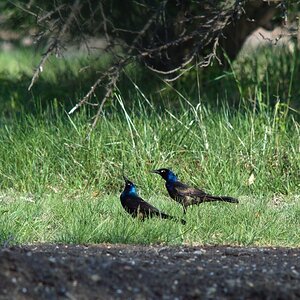
I like what you did with the ladybug. Though I think a portrait orientation with similar comp would show off the flower petal shapes better.
The reworked butterfly pic is a bit too contrasty. See how the detail on the flower is blown out on the highlights? The bottom pic looks decent. Just needs the midrange brightened up a little. Try a push in the curves.
Thanks for the input. The reason I didn't use a portrait comp was I thought that it might distract your eyes from the ladybug. With the butterfly, I had to use adobe raw and recover the blown out section on the lily.
Look at the first shot - what do you like about it? Look at the revision - what do you like about it? Is there anything you like about the first shot that got lost in the revision? Yes? Well, get that into the revision. No? Good, you don't need to look at the first shot any more. Now look at the revision. Anything you don't like about it? Yes? Fix that. No? You're done.
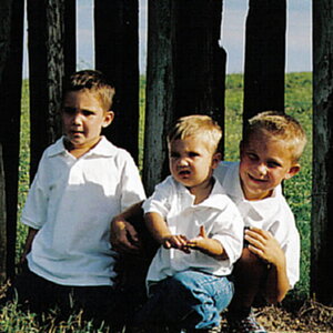
Well....the comosition in #1 is worlds better than #2. In 3, I really like the backlight and glow which you have lost with your edit in #4...only thing I would have done is fix the blown out portion (best you can) in the flower and tried to brighte his face just a tad. Personally I like the un-re-worked versions better.


![[No title]](/data/xfmg/thumbnail/34/34138-0ecadfd41de9ae178e53528e0eb1a32c.jpg?1619736310)

![[No title]](/data/xfmg/thumbnail/34/34134-d2249816e46b705693bfc543c9b1f481.jpg?1619736306)