Recent Portraits

stellar_gal

TPF Noob!
Joined
Jan 22, 2007
Messages
171
Reaction score
0
Location
Texas
Can others edit my Photos
Photos OK to edit
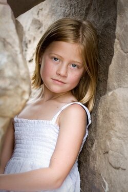
Here's a session I did over the weekend. C&C welcome.- note that I am still in the post-procession phase and some of these are aiming for the blown out look-which is popular here, so I am still making adjustments.


Trying to decide- Flower or No Flower (for my Home Page photo).
1.
IMG_0226bcopyWeb.jpg


2.
IMG_0226copyWeb.jpg


3.
IMG_0052copyWeb.jpg


4.
IMG_0008acopyWeb.jpg


5.
IMG_9978copyWeb.jpg


6.
IMG_9788bcopyWeb.jpg


7.
IMG_9783acopyWeb.jpg


8.
IMG_9765BWcopyWeb.jpg


9.
IMG_9759BWcopyWeb.jpg


thanks for looking!
 
Beautiful series stellar_gal!

Im not a huge fan of the high key/blown out look in outdoor portraits, but you have certainly captured some great expressions from your lovely model.

Regarding the flowers, I would say they might look better if they were in focus along with the subject (in #1 and #6). As it stands with them out of focus, they really dont fit in the composition IMO.

My favorite would be #2 simply for the fact that the lighting contours her face very nicely, and the color and focus is spot on.

Also, the high key effect looks better in B&W as you have shown in #8 and #9 (again, just my opinion).

Overall, I like the variety of poses and expressions very much. Great job! :thumbup:

NJ
 
Thanks for the C&C NJ. She loved flowers and wanted them in every photo!! I took many of the shots with and with the flower cropped out, just for my own preference. I wish the flower was placed somewhere else in #6 too. I need to adjust #9 too, the face is a little dark I see here. She moved around vey quickly and I didnt change the f/stop to get the flower in a some- like 1&2. My 85mm is the sharpest and some times too long. Oh well, they will have lots of variety- I took way too many- 5 gigs worth! ;)

She was trying to be a supermodel and it was a fun, but hot day!
 
I like the version without the flower. It really competes with the girl for attention in the image. Maybe if she was interacting with it (even just looking). I like the image (#2) a lot...I do with that the closer rock wasn't so close to her...it sort of looks like it's squishing her. Overall, a very nice series of images, well done.
 
Thanks Big Mike. All words appreciated and I'll go with #2.
 
Some great images here! Shame about the blown sky in #6 though.
I think the flower is a little distracting personally.
 
Honestly I think the rocks in front of her in general are a huge distraction to an otherwise nice image wether you have a flower on them or not. Nice series otherwise though.
 
neogfx- #6 yes, we had to shoot mid day, sadly, and most were taken under the trees, but got that direct light in that one unfortunalely. I was kicking myself when I saw it afterwards. it was nearly 100 degrees outside and I got lazy looking at some details.

JIP- I do wish I had moved to the right a little in that shot and showed less rock, but afterwards, I thought overall that it was sort of framing her a little and decided I really loved it. It was a tight space- that she found herself and I just got a few shots off. I think her mom shot coffee into her veins prior to the session- she was ALL over place, so I got what I could- til she moved again. Ahhh, the price of working with kids!

Thanks for your comments- keep them coming please. I am here to absorb as always!
 
You have some beautiful work ;)

Beno dovrazi miami fashion photographer
www.benodovrazi.com
 
Nice work. I prefer no flower. In 1 & 2 I think if you would have brought her forward a bit so as not to compete with the rock section on the left she would have stood out more. The arm in 7 is distracting.
I like the POV in 5,6,8 & 9. Overall, nicely done!!
 
I really like #6 & #9. The white dress what a cute idea too. Always looks good with a green background.
 
i like # 3 n # 7 alot . . the colors are great and the girl looked so cute
 
neogfx- #6 yes, we had to shoot mid day, sadly, and most were taken under the trees, but got that direct light in that one unfortunalely. I was kicking myself when I saw it afterwards. it was nearly 100 degrees outside and I got lazy looking at some details.

JIP- I do wish I had moved to the right a little in that shot and showed less rock, but afterwards, I thought overall that it was sort of framing her a little and decided I really loved it. It was a tight space- that she found herself and I just got a few shots off. I think her mom shot coffee into her veins prior to the session- she was ALL over place, so I got what I could- til she moved again. Ahhh, the price of working with kids!

Thanks for your comments- keep them coming please. I am here to absorb as always!

Don't get me wrong I think there nice shots but that rock is a big blurry blob.
 
no flower its to distracting from her.
 
Don't get me wrong I think there nice shots but that rock is a big blurry blob.


Yeah... BUT....

The lighting is SO very nice in that first view. Maybe if you tone down the rock, make a slightly different crop, and add a touch of vignetting?

The scene has such a nice, mono-chromatic feel. I think it's a good choice for your home page.

-Pete
 

Attachments

  • $IMG_0226bcopyWeb.jpg
    $IMG_0226bcopyWeb.jpg
    86.2 KB · Views: 72

Most reactions

New Topics

Back
Top