kellylindseyphotography
TPF Noob!
- Joined
- Mar 26, 2008
- Messages
- 1,270
- Reaction score
- 0
- Location
- Haverhill, Ma
- Can others edit my Photos
- Photos NOT OK to edit
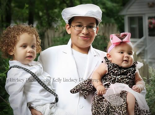
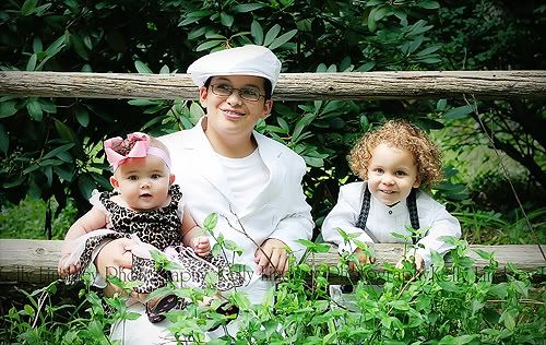
Did this session for a friend.. teh 2 yr old was very sick, but she didn't want to cancel on me! I told her I would have understood of course... but alas. Here's what I go. Would love HHCC on everything. Shot with my Rebel XT, 50mm lens, mostly F4 and shutter varied between 200 and above. A few were in direct sun because I had the lovely oppurtunity of mixed lighting of sun coming in and out of the clouds :getlost:
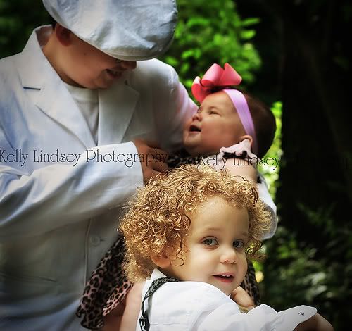
1.
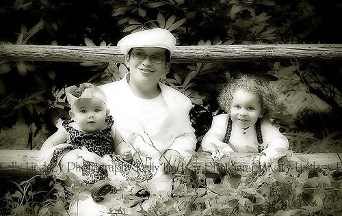
2.
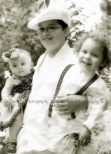
3. (does this work? I like it!)
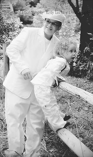
4. which one, color or b&w? does the conversion work? the whites are hot, but shouldn't be too hot..

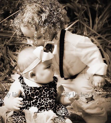
5.
6.

7.

1.
2.
3. (does this work? I like it!)
4. which one, color or b&w? does the conversion work? the whites are hot, but shouldn't be too hot..
5.
6.
7.
")