- Joined
- Dec 16, 2003
- Messages
- 33,896
- Reaction score
- 1,853
- Location
- Edmonton
- Website
- www.mikehodson.ca
- Can others edit my Photos
- Photos NOT OK to edit
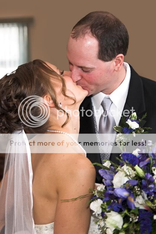
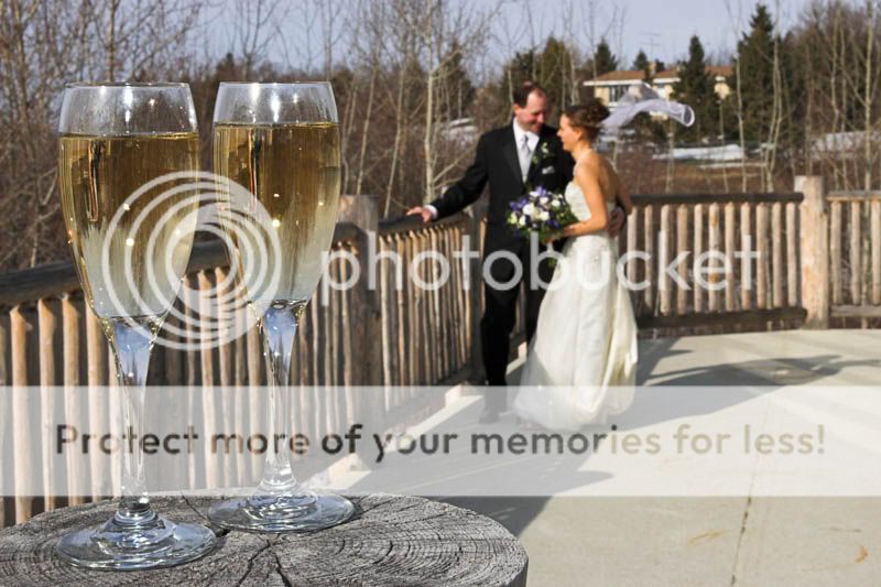
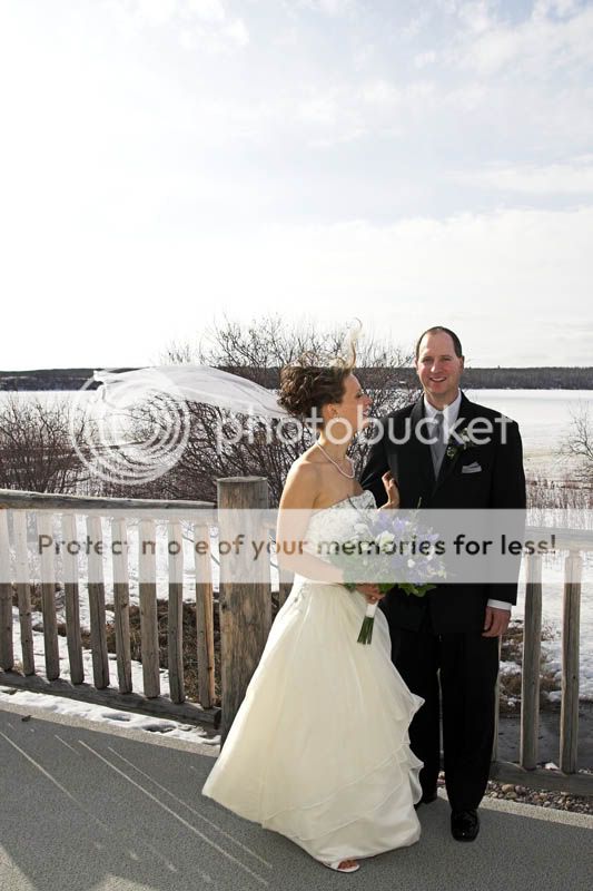
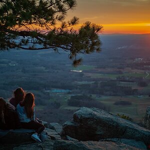
Here are some previews from my Mar 31 wedding shoot. Any thoughts or critique?
#1
#2
#3
#4
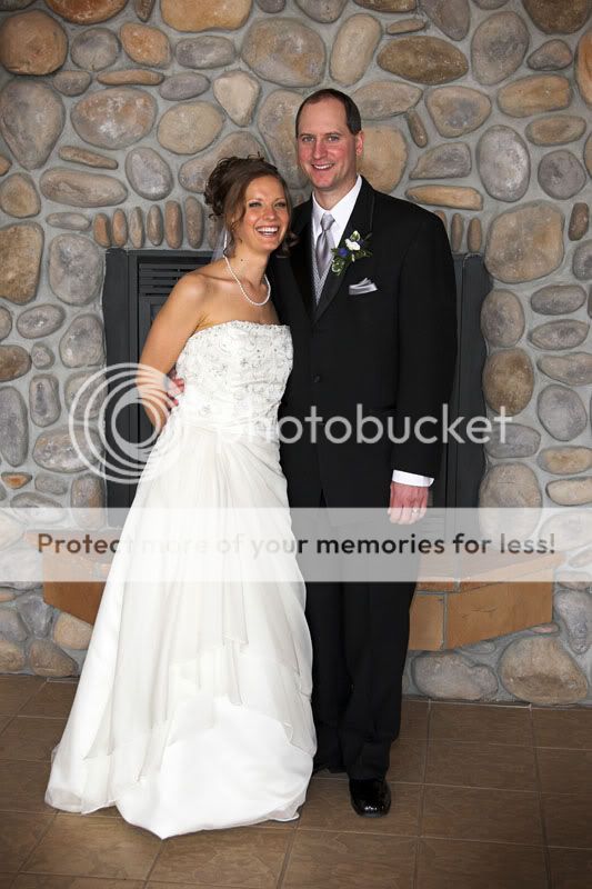
#5
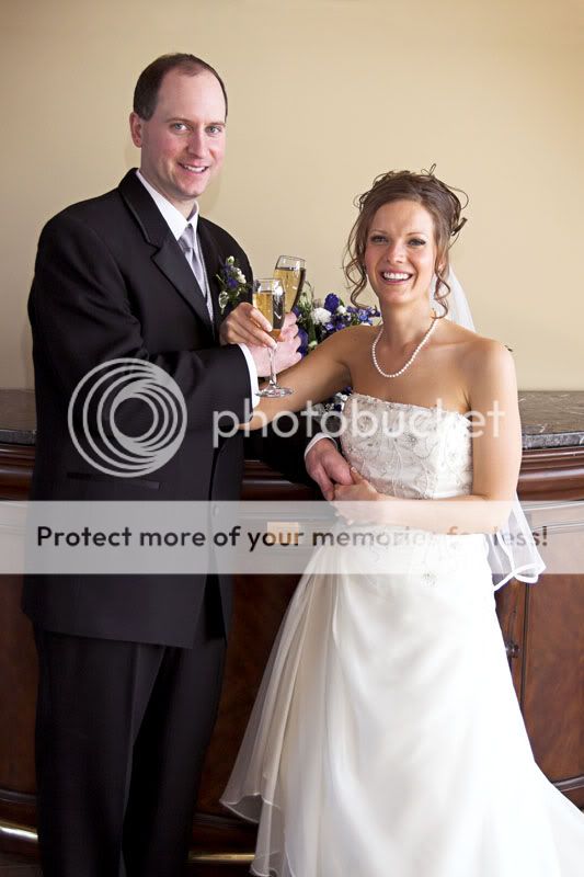
#6
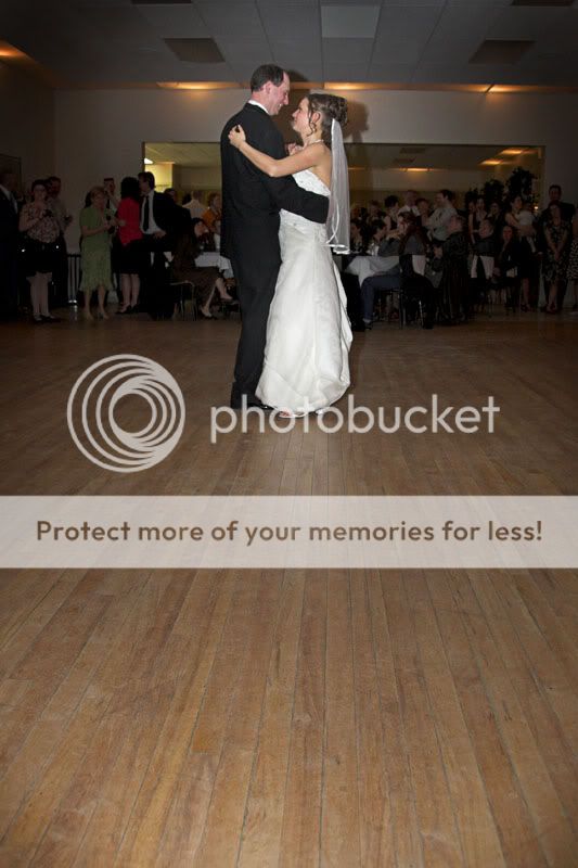
#3 & #6 have extra space so they can be written on (as thank you cards).
#1
#2
#3
#4
#5
#6
#3 & #6 have extra space so they can be written on (as thank you cards).


") Maybe best to have them looking at each other? Maybe the low res but this doesn't look as sharp as it could be either.
Maybe best to have them looking at each other? Maybe the low res but this doesn't look as sharp as it could be either.


![[No title]](/data/xfmg/thumbnail/31/31978-02cde49248ebdf1b82fba5c899e08378.jpg?1619735136)
![[No title]](/data/xfmg/thumbnail/37/37608-63b0d340b0972479217b548a4026df96.jpg?1619738149)