Reddin White

DGMPhotography

Been spending a lot of time on here!
Joined
Mar 23, 2012
Messages
3,160
Reaction score
718
Can others edit my Photos
Photos OK to edit
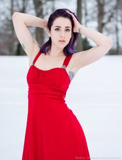
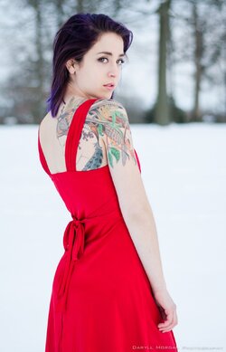
A play on words... her last name is Reddin... and she's wearing a red dress, in the snow... which is white.


I'll shut up now.

Here are some pictures - lemme know what you think!

1) I should have had her drop her arms.
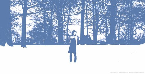
DSC_0007 blue.JPG

2) Pretty, no trees growing from her head.
DSC_0034.JPG

3) Pretty glamorous if you ask me
DSC_0052.JPG

4) Eh, it's nice, not amazing. Don't have much reason either way.
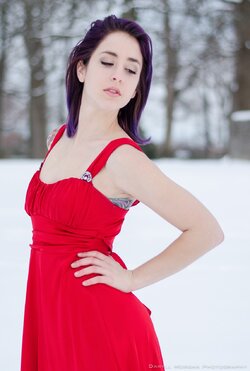
DSC_0063.JPG

5) This is my favorite :)
DSC_0080.JPG

6) This could have been a lot better.. I should have shot from above her face, instead of up her nose.
DSC_0117.JPG

Thanks!
 
#'s 3 & 5 are my picks here.
 
Not bad; I"m a fan of #3 as well. What lens did you use? There's some wicked CA happening around her legs in #2.
 
I like 2 and 3 and 5 the most. She's absolutely gorgeous. You ought to work with her again.
 
Nice shots. The first one is pretty neat, it has a retro feel to it.
 
Not bad; I"m a fan of #3 as well. What lens did you use? There's some wicked CA happening around her legs in #2.

Yeah, I just noticed that too. I was using the 50mm f/1.8
 
I like 2 and 3 and 5 the most. She's absolutely gorgeous. You ought to work with her again.

Haha, this is actually our second shoot together. We have a pretty good rapport, and lots of shoots planned.
 
Great work! I'm a big fan of color and contrast. You have both here. Very interesting. Beautiful young lady as well.
 
Great work! I'm a big fan of color and contrast. You have both here. Very interesting. Beautiful young lady as well.

Me too!

Glad you like it :)
 
#3 & #5 also....
 
#3 & #5 also....


Seems to be the popular choice, and I agree.

But for critique sake, do you (and anyone else who feels the same way), feel like explaining why they prefer those images? I know why I do, but I'd like to hear others' thoughts.
 
#3 & #5 also....


Seems to be the popular choice, and I agree.

But for critique sake, do you (and anyone else who feels the same way), feel like explaining why they prefer those images? I know why I do, but I'd like to hear others' thoughts.

Compared to the rest, 3 and 5 are engaging. They draw you in to the model in such a way that you feel like you are connected to her or like she is actually standing there in front of you. Those images do that very well and the others don't do that at all.

I agree with your own comments on 6.

It could just be my monitor.. but I think these are all slightly underexposed.
 
WHY 3 and 5? Okay...

Why3:Fairly close-in, so a large sized face with easy visibility, direct eye contact, pouty, open mouthed expression, overhead arms are sort of flirty, underarms are an erogenous zone, waist looks nice and small, caboose looks nice...good curve to the body.

Why 5: small waist, nice trunk, over the shoulder is considered sexy, we can see her tat reasonably well, subject occupies a lot of the frame. Good curve to the body, her small waist is emphasized very strongly.

The other shots like one and two have her very small in the composition, and in shot #1 she's like a speck. On the last shot, she's lying down and her hand look like it's freezing cold.
 

Most reactions

Back
Top