gpardo64
TPF Noob!
- Joined
- Jan 16, 2010
- Messages
- 147
- Reaction score
- 0
- Location
- Alpharetta
- Website
- www.flickr.com
- Can others edit my Photos
- Photos OK to edit
Reflecting Our Distortions (BESP 4)
This week assignment was about reflections. The objective was to get some reflections from any type of objects (shiny materials, mirrors, water, etc). Also the object shouldnt be shown at all and hopefully it is going to show up distorted.
Settings
D5000,
#1: 1/125, ISO 100, f/11, Handheld.
#2: 1/45, ISO 100, f/6.7, Handheld.
#3: 1/125, ISO 100, f/11, Handheld.
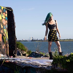
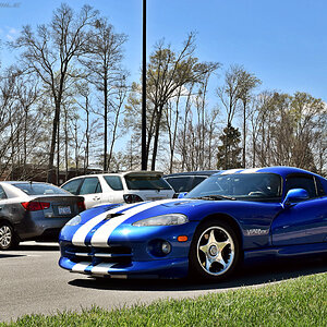
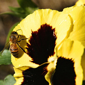
#1 Big Mirrors
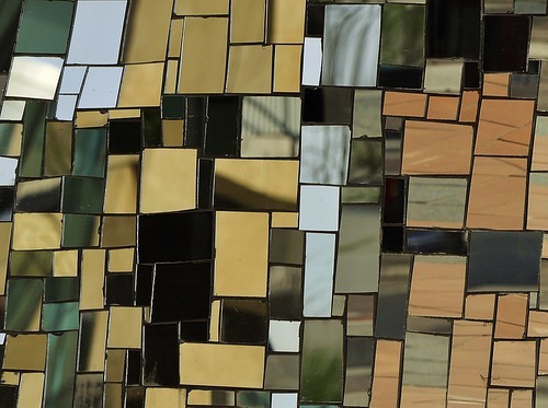
#2 The Mast

#3 THE Reflection
I am sorry for showing more than 2 pics, this may not be necessary my best shot out of the 3, but I needed to show this one because I think, this is our official reflection image here in the US. It was taken in the Reflecting Pool in Washington today

Please give me your comments, they will be really welcome!
This week assignment was about reflections. The objective was to get some reflections from any type of objects (shiny materials, mirrors, water, etc). Also the object shouldnt be shown at all and hopefully it is going to show up distorted.
Settings
D5000,
#1: 1/125, ISO 100, f/11, Handheld.
#2: 1/45, ISO 100, f/6.7, Handheld.
#3: 1/125, ISO 100, f/11, Handheld.
#1 Big Mirrors
#2 The Mast
#3 THE Reflection
I am sorry for showing more than 2 pics, this may not be necessary my best shot out of the 3, but I needed to show this one because I think, this is our official reflection image here in the US. It was taken in the Reflecting Pool in Washington today
Please give me your comments, they will be really welcome!
")
![[No title]](/data/xfmg/thumbnail/36/36667-b3265abf8272f21d759a0abd6a0995c3.jpg?1619737676)