Retouching in Photoshop

dadaR6

TPF Noob!
Joined
Jan 26, 2004
Messages
8
Reaction score
0
Location
San Jose, CA
I dont really know where to put this post, so here it goes.
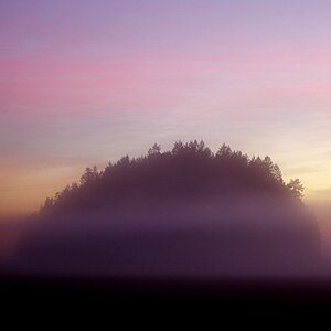
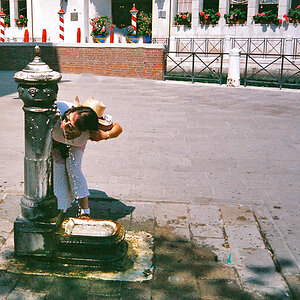
A lot of image i am getting turn the same way as this one (I am not talking about composition, only about color, contrast...).
Is there someone here that could spend 2 mins to try to adjust it, and post the different steps.

Thanks in advance,
David

IMG_7960_resized.jpg
 
Layer > New Adjustment Layer > Brightness/Contrast
1. Decrease Brightness (-16)
2. Increase Contrast (+29)
Layer > New Adjustment Layer > Hue/Saturation
1. Increase Saturation (+27)
2. Decrease Lightness (-14)
Left Hue as is (0)
f7292038.jpg
 
Thanks for the try. It definitely looks better.

Anyone else? :?:

Also do you guys have any idea why the original pic came out this way? :roll:
 
Basically it's really flat, so I boosted contrast, saturation, sharpened it, and straightened it. My guess is it's about a stop overexposed due to all the brightness the haze is causing (the rocks/tree in the lower left-hand corner look ok).

Not sure what graphics program you're using, but just using the "auto touchup" function would help a lot. Anyway, here's my stab at it:

33421708.jpg
 
Here ya go.

canyon.jpg


In photoshop, I used a levels adjustment layer and brought the shadows slider up to the edge of the histogram, and the same for the highlights, then I used the shadow dropper and picked the shadow in the bottom middle and clicked it, to make that the darkest point. This increased the contrast tremendously. Then a saturation boost of 20, and a color balance with reds and yellows in the midtones and highlights (To correct that bluish cast), and a USM of 20%, 10, 0, and 500%, 0.2, 0. That's it.
 
I have found in Photoshop that a quick fix and a good starting place a picture like this, is to start with auto level and auto color. Auto level can be done with ctrl+shift+L, and auto color would be crtl+shift+B. You can also do this with Image->adjustment->auto level and image ->adjustment -> auto color.

From there, I play around manually with contrast, etc. I am using photoshop 7.0 by the way, may differ with older/newer versions.
 
I am just learning how to use curves, have done a few B&W's so I thought I would give this colour one a crack.

I only used curves, but wasn't happy with the background so I selected that seperately then used curves again.

At the end I added +8 saturation to add to that red rock a bit more.

A tutorial on curves can be found here: http://www.gurusnetwork.com/tutorial/curves/

Hope that helps :)

IMG_7960_resizeda.jpg
 

Most reactions

New Topics

Back
Top