RGB Photo dot Com

mikeliketrike

TPF Noob!
Joined
Dec 27, 2003
Messages
23
Reaction score
0
Location
Bangor, Maine
This is my first post in this community so here it goes :wink: :

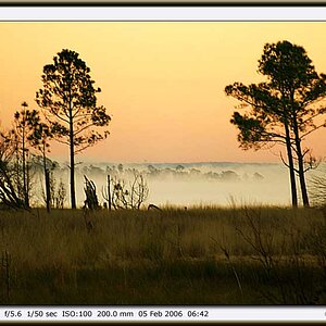
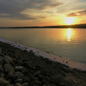
My web page is http://www.rgbphoto.com and I've put it through many many facelifts until I've finally settled on the current theme. Feedback on it is very welcomed. I'll be sure to go around this forum and place some as well.
Thanks!
 
nice photos and layout ... i like the color scheme u got going :D
 
I like your site Mike as far as blogs go this is one of the neatest i've seen. The "caged in" photo in gallery 1 is very similar to the one i have on my site. Spooky 8) Nice work alltogether and very easy to navigate. Also loads pretty quick.
 
just had a peek, nice layout but the photos are awesome. just bookmarked so i'll come back later when i have more time :)
 
Your photos are good, a little too many posted for my tastes though. From a web design point of view I also like the color scheme, and the clean design. I dont like it when you scroll over the numbers to see more photos and even when the little box turns green, you still need to click directly on the number to view the photos. Also when the images do come up, I dont like the pop-up window which the image is shown in. Pop-ups are usually associated with annoying ads, your photos are far from annoying, but the pop-up are. My monitor settings are set at 1024X768, and the image is still too big for my screen
 
Thanks for the feedback, but I would like to address some concerns to explain why some things are the way they are.
As far as the number of photos being a lot, I did that because I've taken a lot of photos that I'm proud of and wanted to display them. And photos that I might not think are done well someone else might think it's a wonderful photo. So I let the end user decide whether to look at the photo or not, I just wanted to give them a large collection to choose from.
Also, you have to click directly on the number for each photo set because it's the number that's a link, not the square. I ripped code that made the cell highlight. I did this so I could easily update the site. If I wanted to change the structure of how things are grouped, then I don't have to make another image map, just change some text.
Lastly, I made each photo come up in a pop up window because I had many many requests to make my photos larger on the site. People who wanted to use a photo as wallpaper for their computer, or other purposes needed to have it available larger than what I had before. Also, doing it in a pop up also allows me to show the exif information if available. I also like the idea of pop ups because it makes each large photo it's own. There's no distraction for the user, all the focus can be set on it.
There, I'm done :) I just wanted to defend myself a little bit because I'm very happy with what I've done and have thought long and hard about the site itself and I wanted to justify my decisions.
 
Hey Mike...I like the site, it's easy to get around. There was one photo that I clicked on that didn't load however (I think it was in photo set 3, one of the first photos in it), but it might have been my computer..it does stupid things from time to time. Best of luck to you.
 

Most reactions

New Topics

Back
Top