Right decision or ?

tirediron

Watch the Birdy!
Staff member
Supporting Member
Joined
Jul 8, 2005
Messages
45,747
Reaction score
14,806
Location
Victoria, BC
Website
www.johnsphotography.ca
Can others edit my Photos
Photos OK to edit
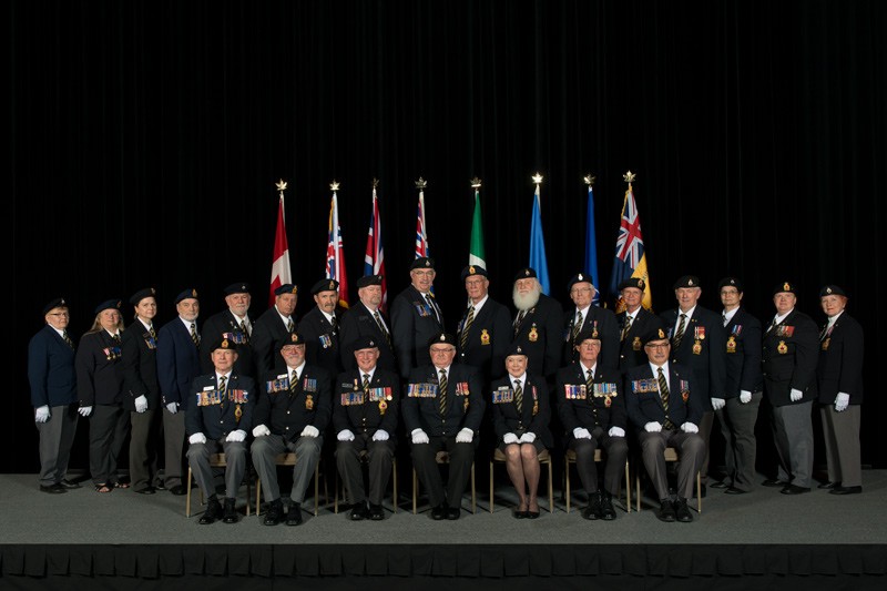
The image is of the newly elected officers for the Royal Canadian Legion (BC/Yukon Command). The arrangement is predetermined, and the flags are a requirement. I made the deliberate decision to place the people where I did in relation to the flags so that fabric didn't 'bridge' the space between faces, but are they too close to 'growing out of the heads'? I suspect that this is something only a photographer would obsess over, but... I'm obsessing. Should the flags have been moved into the gaps between the people or not?

Legion_Off_Web.jpg
 
I actually prefer the black space between the faces.
the flag colors are obvious enough to be flags and do not keep going up into the sky like a tree would.
 
Maybe I'm just stoned, but to me it kind of looks like they're wearing really fancy cone-hats. I think perhaps if you placed them in between their heads it might have worked better, and it would have given more detail to the flags and shape to their shoulders as well.
 
Last edited:
The two in the center are the issue. The flags are too close in width to the hats and look like a continuation of them. If those two center flags were unfurled just a bit more it would look better, IMO.
 
As for me, I'd have positioned the flags just a little higher and a bit further away from this persons in the back, secondly I'd have placed the flags between the soldiers.
(or perhaps, place all the flags somewhat closer together and position them in the middle, so there will be smaller caps between these flags and don't give the idea of growing out any soldiers head)

Furthermore I'd cut off a big piece of the top and clone a piece of the carpet.
But...complements for your lightning, I know how difficult it is to photograph such a big group, plus dark cloths and dark background! :icon_thumbsup::icon_thumbsup:
img.JPG
 
Last edited:
Should the flags have been moved into the gaps between the people or not?
With an even number of flags, it wouldn't work out well mathematically. I don't mind the flags lined up with the people.
 
I like the black space between the faces, as well, so I would likely have gone for the same thing!

That said, I do agree with Peg that the issue is really the two center figures, and it's only because the flags seem to be furled so closely that they are the same size as the heads in this part of the frame. It's a non-issue the further the eye travels from the center, where you can see the flag outside of the heads and actually coming down to shoulder level. Visually, that looks better than the unintentional cone-cap look of the two in the middle, that Dan pointed out.
 
I wouldn't change a thing but what do I know?
 
I actually prefer the black space between the faces.
the flag colors are obvious enough to be flags and do not keep going up into the sky like a tree would.
Thanks!

I think it works in this shot, mainly because it looks like a deliberate placement and not carelessness when framing the shot.
Thanks Pete.

Maybe I'm just stoned, but to me it kind of looks like they're wearing really fancy cone-hats. I think perhaps if you placed them in between their heads it might have worked better, and it would have given more detail to the flags and shape to their shoulders as well.
That's my concern as well; as one would expect, timings got fouled up and I was left with only a short time to do this shot as the venue crew were setting up for the next event. Normally I would have taken 15-20 minutes just to get all the flags pinned and taped exactly how I wanted, but in this case all I really had time for was, "Between or behind?".

The two in the center are the issue. The flags are too close in width to the hats and look like a continuation of them. If those two center flags were unfurled just a bit more it would look better, IMO.
Good point - maybe some work with liquefy & clone.

As for me, I'd have positioned the flags just a little higher and a bit further away from this persons in the back, secondly I'd have placed the flags between the soldiers.
(or perhaps, place all the flags somewhat closer together and position them in the middle, so there will be smaller caps between these flags and don't give the idea of growing out any soldiers head)

Furthermore I'd cut off a big piece of the top and clone a piece of the carpet.
But...complements for your lightning, I know how difficult it is to photograph such a big group, plus dark cloths and dark background! :icon_thumbsup::icon_thumbsup:

Thanks for the kind words on the lighting; that the was the easy part! A Speedo D1604 at half-power driving two M11 heads firing into 42" reflecting umbrellas. I had to have the heads up about 13' due to the height of the stage, which made things a little sketchy! Unfortunately there was no option for greater separation; the flags are only maybe 2' in front of the stage curtains at most. I haven't decided on the stage/carpet; I'm waiting to hear from the client on whether they want this as a 2:3 or a 4:5 and then I'll play with that. I may try moving the flags, just for giggles...

In this shot I think it works having the flags as they are, but I also believe it would work between as well.
Thanks Trev!

Should the flags have been moved into the gaps between the people or not?
With an even number of flags, it wouldn't work out well mathematically. I don't mind the flags lined up with the people.
Cheers!

I like the black space between the faces, as well, so I would likely have gone for the same thing!

That said, I do agree with Peg that the issue is really the two center figures, and it's only because the flags seem to be furled so closely that they are the same size as the heads in this part of the frame. It's a non-issue the further the eye travels from the center, where you can see the flag outside of the heads and actually coming down to shoulder level. Visually, that looks better than the unintentional cone-cap look of the two in the middle, that Dan pointed out.
I definitely need to try tweaking that a bit then...

I wouldn't change a thing but what do I know?
I'll play your game... what do you know? ;)
 
Last edited:
That's my concern as well; as one would expect, timings got fouled up and I was left with only a short time to do this shot as the venue crew were setting up for the next event. Normally I would have taken 15-20 minutes just to get all the flags pinned and taped exactly how I wanted, but in this case all I really had time for was, "Between or behind?".
For having such little time to work, you did well in my opinion.
 
Between would've been my preference but honestly I wouldn't have noticed at all during setup and just shot however.
 

Most reactions

Back
Top