Rough Draft

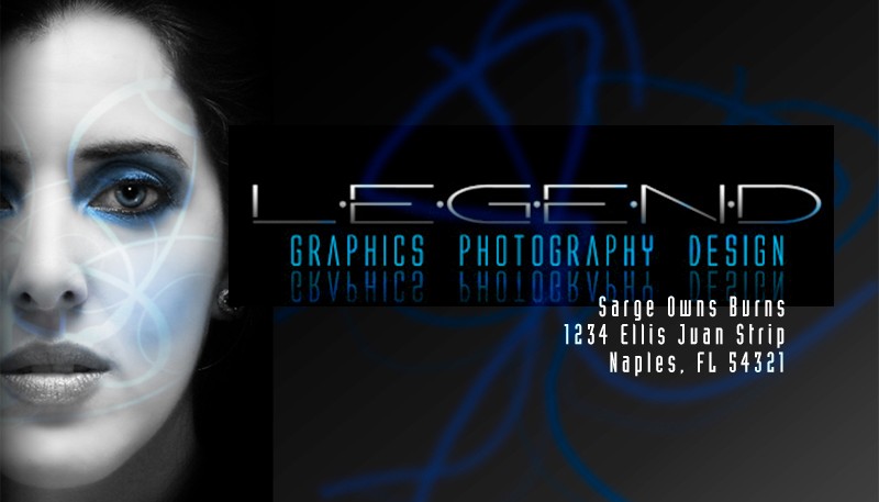
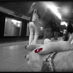
are you having them custom printed? if you wanna maintain the horizontal you should consider a 3.5" x 1.75" format

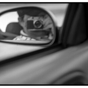
Yeah, I'm going to have them printed 3.5 x 2. But this is the enlarged version so everyone could see the details.
 
here, i messed with it, i konw it's rough but it should help make sense of what i said:

burnsCard.jpg
 
Lmao. Hahaha. Ok I got you now.

And sarge only owns me because he's a mod. He had to make up all that bs about me being lawdog for ppl to get on his side. Lmao. I still had a great time there. That place was hilarious.
 
Print that out at 100% and I think you'll find the font pretty much goes away. If you want a nice thin face like that you'll have to lighten the color of the font up, or I'm sure it's going to start to close up on you. The same goes for the reflection of the text, it'll probably not be what you think.

Try a 100% and see what you think.
 
Hmm...I'll have to take that into consideration. Does that quality degrade that much?
 
I like the kinda monochrome look, I thought the red was a little too strong. Have you thought about taking the swirls off completely and making them a spot varnish over the entire card?
beautyhasnolimitce0.jpg
 
nice it looks scary at the first LOL
 
I think it looks very cool. But yeah, I think you should consider making the font a little thicker at least. I love the photo but I think the blue stripes are kinda destroying the photo. Well that just what i think ;)
 

Most reactions

Back
Top