rule of thirds for the week theme

sburatorul

TPF Noob!
Joined
Jul 2, 2008
Messages
369
Reaction score
1
Location
a place few people heard of
Can others edit my Photos
Photos OK to edit
sorry i am late with this guys but i am in that period of the year when exams take over my life. i did manage to get some decent photos this weekend. check it out!

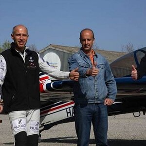
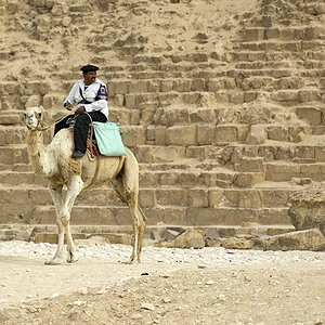
curiosity. almost ran this dude over. luckily i didn't
55-200mm @ 175mm, iso 400, f8, 1/125s
pidgeonforflickr.jpg

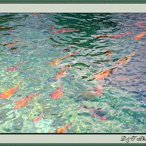
dunno why i like it most like this, acording to the rule of thirds but i hated the photo centered.

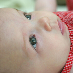
panning. 55-200m @ 55mm, iso 400(guess i forgot it like that), f10, 1/30s
panningforflickr.jpg

i like that the empty space in the left accentuates the idea of speed and gives the subject space to go.
 
The bird shot is cute and it follows the ROT well but it looks a little blurry. The second photo follows the ROT nicely too. :)
 
The bird shot is cute and it follows the ROT well but it looks a little blurry.
I think you're mistaking shallow DOF with OOF. The eyes of the pigeon are in focus and sharp. Because of the combination of aperture, focal length and distance to subject the DOF isn't very deep.
 
Nice shots! I think the first is nice, although the DOF is a bit shallow for my liking, but still a good shot. Follows the ROT well too.

The second shot is great! I like the panning on it and the motion lines do help create a better sense of movement and speed. The only thing that bugs me is the orange light on the right side of the frame, but it's a minor thing.
 
Love the pigeon. Nice capture. It looks great for the ROT assignment (and otherwise). You did a great job getting those eyes in focus.

I like picture #2 as well. You've left nice space on the left for the motorcycle to drive into. Great panning. The only part that is a little distracting is that orange light in the top right. I might have cloned that out, but no big deal.
 
I love the bird shot, it is so cute. Makes that nasty little bird look cute! :)
 
1. I like the blurred out backround in shot 1, it compliments the subject nicely. It's really wonderful how the background actually draws you into the image. The greens turn to yellows around the birds face and it really makes it pop.

2. Good panning technique. I like this image as the background is not too distracting. The only thing that irks me a bit is the slight tilt of the horizontal lines.

Thanks for sharing!
 
when panning things like tilted lines tend to occur. the original was even worse but i straightened out a bit... didn't want to go all the way not to make it to flat looking. thanks for looking
 
when panning things like tilted lines tend to occur. the original was even worse but i straightened out a bit... didn't want to go all the way not to make it to flat looking. thanks for looking
I realize tilted lines tend to occur, but when it's only very slightly off, it tends to look unintentional. Just my point of veiw... I do like the image though :)
 
Nice images. Not much I can say. I really like the blur you achieved with that pan. Great color on that pigeon.
 

Most reactions

New Topics

Back
Top