Salon Model Shoot (Might be NSFW)

SpeedTrap

TPF Noob!
Joined
Oct 2, 2006
Messages
1,392
Reaction score
26
Location
Edmonton
Website
www.lightart.ca
Can others edit my Photos
Photos NOT OK to edit
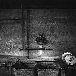
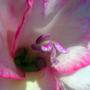
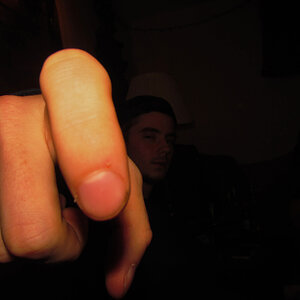
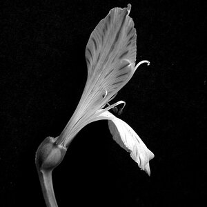
Here are some from a shoot that I can now release, as always C&C welcome.

1)
LightArt_7_.jpg

2)
LightArt_6_.jpg

3)
LightArt_5_.jpg

4)
LightArt_4_.jpg

5)
LightArt_3_.jpg

6)
LightArt_2_.jpg

7)
LightArt_1_.jpg
 
I think #6 is probably the only one that stands out for critique to me. She seems to have an odd pose and her hand was cut off. The others with the cut-off limbs I actually enjoyed. For the rest very good job I would be proud!
 
Hard to really critique so many images in one thread, but I'll see what I can come up with.
I'm not really a fan of the background(s) used here. It sort of looks like a 'cheap prop', like you'd expect to see in a kindergarten play. It doesn't really go with the glamorized models. IMO

#1. Model's face & hair look good. Body position & pose, not so much. Straight on position isn't all that flattering (although I'd guess that she's a model, not a client, so it may not be critical to 'flatter her). I really don't like the differences in height between her shoulders. Could use a bit more contrast on the low end.

#2. Like the model, like the hair, don't even mind the BG in this one. What I don't like is her pose. With a quick glance, it almost looks like her head is on a backwards body. I guess it's not an uncommon post for a model to throw their shoulders forward, but I've personal never liked it.

#3. Same straight on position as #1, doesn't bother me as much in this one, but I'm still not sold on it. Finger tips cropped. Loose threads on one of her straps. Is she a new model? I think this shot is missing something, but I can't put my finger on it...maybe it's just a lack of emotion from the model...I'm not sure.

#4. I like this shot, this one has the emotion that #3 is lacking. I would maybe like to see the composition a bit more even here, but it's not a big deal. I don't like the look of the model against the colored background, maybe it's only on these web sized versions, but it has the feel of a sloppy background replacement. I'm wondering if a back accent light would have helped to define her shape a little better. Her one breast is a little bright, maybe just less tanned that the rest of her, but it's clearly the brightest part of her.

#5. I really like this one. The model, the hair, the pose...all good. I don't like the cut out of the arch, as mentioned before. Cropped the fingers and there are lots of loose threads on this one (maybe that's on purpose?)

#6. This one looks good, although I can't say I'm a fan of the hair style. The tightness of the composition/cropping one this one is...off. I don't want to say wrong, it sort of works as a whole, but individually, her elbow is too close to the arch wall, her fingers/hand is cropped though, it feels too close to her on the right side (though her arm & hip) and above her head. I want to say that if you are going to go for a tighter composition, then go for it and get tight...don't just go half way there. Of course, you may have a perfectly good reason for leave the space on these shots. IDK.

#7. I love the model, hair, expression, pose etc. I want to crop this one much closer as the cage dress feels like it's taking away from the model's face, which is outstanding here. I'm sure the shot is about the hair/clothes, so cropping it that tight probably isn't an option though.
Again, the overall composition is unbalanced, too close to her hands with too much space on on side...but like I said, that may be for a reason. We can really see a lot of thread on the cage dress, so much that I can only assume it's supposed to look like that. That's OK, at least it's consistent. In the other shots, where we can only see a little bit, it looks like it was just missed. This one also feels like it could use a but more contrast, maybe in the mid-tone region.

Overall, a very good, professional looking set. Hair, makeup, wardrobe all good (although that's probably not your doing, but you showed it well).
The lighting is pretty good. If anything I'd like to see a little deeper ratios, as some of these are bordering on being too flat. And with all the bare arms, I think that some back/accent lighting on them, could really help.
 
What the hell are those backgrounds?
 
I really like #4...but I'm a sucker for brunettes....so my opinion is probably biased.
 
Personally, I'd like to see more contrast in all of them. To my eye them seem a little washed out/over exposed....I know that look is popular, it's just not what I like.
As has already been mentioned, I'd have tried not to crop quite so close, poor girls lost some fingers....
 

Most reactions

New Topics

Back
Top