
Alexandra
TPF Noob!
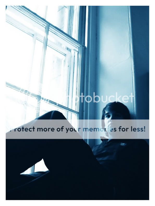
Okay, so i'm having some doubts here. The lighting was very poor, and i don't know if this is too dark. what do you think?
Also: is the blue too much? his uniform was already dark blue plus the colorization really darkened the shot. So, what are your opinions on this? any suggestions?
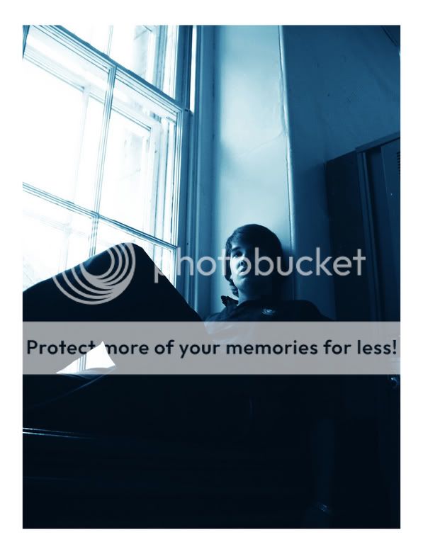
Also: is the blue too much? his uniform was already dark blue plus the colorization really darkened the shot. So, what are your opinions on this? any suggestions?
")


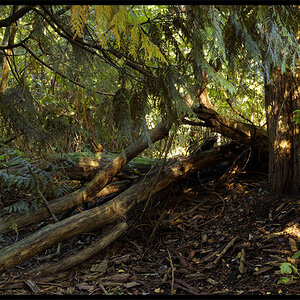

![[No title]](/data/xfmg/thumbnail/37/37114-2bba6b6cc4df1fe53588503fb35af8dd.jpg?1619737883)
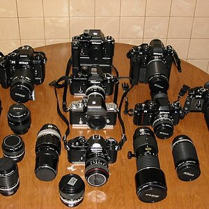
![[No title]](/data/xfmg/thumbnail/37/37133-3388fda4190cd07dbd7950af7b6ca646.jpg?1619737884)
![[No title]](/data/xfmg/thumbnail/37/37113-886cb28b1e3fb197bdd00a9148269407.jpg?1619737882)