Schwetty's "Best of 2011"

Status
Not open for further replies.
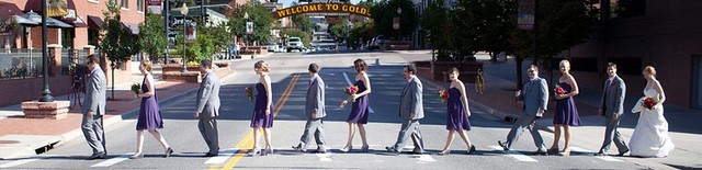
Eeek.. Just finished watching the Broncos beat the Steelers. GO BRONCOS! KAikens, I really think you misunderstood what I was saying on the CC for Kerb. When I said not "best of" material, doesnt mean the shot is necessarily bad. I would have delivered those shots to the client. Perhaps put it in an album somewhere to make the set stronger. I was just trying to say a photo of bottles of wine isnt really a "best of" material. If I client ask for my best shots, I give them the "steak" and not the "mash potato". There is no way I would show them mostly detail shots. If I did show it, I would not show same ring twice and definitely wont show 50% of my "best" shots with ring shots. If the title wasnt "Best of", perhaps I would have CCed it differently.

You guys definitely put up an amazing finish. Heck, half way through I was rooting for the Broncos and getting upset that they couldn't put the Steelers away. That backward pass/fumble call was absolute crap and just about cost them the game. Either way, spectacular finish.

As far as my photos, like I said, it's not really a big deal to me. Personally, I like the detail shots and want to get better at them. It's something I enjoy. Obviously, you know I took thousands more during the ceremony and at the reception. I could have easily not shown any detail shots. I just sat at my computer, had a few beers, and went though review mode in Bridge. Those just happened to be the ones I picked to process.

Again, no worries. I still default back to the first PM you sent me this year. It's time to give all of this a rest...

Regards,
George
 
Last edited:
Thanks for the detailed critiques KAikens318. Maybe you should do best of 2011 too. You should have enough to do one.
EpixStudiosNH : Weddings | SmugMug

I have a few critiques...

1. Too soft, no contrast

2. Again, blurry, keep trying at the panning shots, they are hard to do

3. More contrast, they blend in too much with the forest, she looks pissed off

4. I like the concept, would have cloned out the SUV at the end of the street, shot is too far to really see any of the people, maybe burn them a tad and give them a little more contrast so you can make out some of their details.

5. Too much dead space, I know you are following rule of thirds but there is not enough subject in this.

6. Bride's nose looks like it has suntan lotion on it. Tweek the contrast a little, try to get rid of the super white nose

7. Nice color in the sky....who are those people standing on the hill? Can't tell, they are too dark and far away.

8. I like this one, maybe just a little more saturation

9. I like the train running by in the background. Tad more contrast again.

10. Not a fan of this one, JMO

11. Good lighting, great pose, great expression

12. Nice cake shot.

13. I like it except for the woman in the left. Cropping would be too tight and cut off some of the bride's arm, swinging out into the aisle a little more would have helped that. Cloning her out might not be too hard.

14. Good lighting, nice colors, kind of wish the groom was looking at the camera and the bride was looking at him

15. Needs to be closer. Can't make out the bride and groom. Otherwise technically good

16. I am not a fan of this one. Too many branches in the way. Otherwise good concept

17. No. The veil is too much in the way, looks too soft, underexposed.

18. I like this one. Maybe a little bit of a tighter crop

19. Good expression, very pretty bride, in focus, maybe a little less red on the left.

20. The light from the windows is too blown out, you can't see the details in the dress.

21. Again, too many branches in the way of his face but I like the concept.

22. Needs a tighter crop, all my eye goes to is the massive amount of red around the couple

23. Too blown out, maybe burn the family or something to bring their details out. Good focus otherwise.

24. Again, too blow out. I know snow is hard to work with.

25. I like this one. Good contrast between the main subject and the background

26. Great colors, great focus, excellent candid shot

27. Again, great colors, great focus. I think this was your best shoot

28. Baby sacrifice? Not loving the idea. Focus is on the bowl, not the baby's eyes.

29. Hmm..babies in places where they should NOT be. I see a pattern. Sorry, don't like this one. Technically the focus and lighting is good.

30. I like this one, good expression, casual pose, good contrast between subject and background, good exposure and saturation.

31. Maybe bump up saturation a tad but other than that looks great

32. The reflection on her leg from the water is not flattering, it looks a little like cellulite even though I know it's not.

33. Good expression, great focus and colors, watch the cropping of limbs.

34. Good colors but her left foot is missing...

35. I really like this one, very Vogue.

36. I like her face in this one, but it looks like she has no legs

37. Unnatural pose. Sorry, not a fan of this one.

38. Excellent macro, nice reflection in the drop

39. Again, great macro

40. Great wildlife shot, don't have many of those animals around here

41. I really like this one too.
 
Nice work Schwetty! Pics look great. I'm sure 2012 will be a great year for you for photography.

I have to LOL at the way all threads seem to take the route of someone getting offended and arguing back and forth! So much drama...probably the effects of watching too much reality tv :lol:
 
Great start, wonderful collection. All the best in 2012. Keep up the great work.
 
Thanks for the detailed critiques KAikens318. Maybe you should do best of 2011 too. You should have enough to do one.
EpixStudiosNH : Weddings | SmugMug

I have plenty to do a Best of however, most of them would not be wedding photos. Weddings are not my best by far, I need better equipment to make weddings the best of the best of my portfolio. Mine would be sports, detail shots, animals, and food.
 
With me being new to this forum, I don't want to be tagged as a troll who is only about kicking others photo's. There is one thing that most cannot understand. Everyone has different styles! There are things I dislike about photo's that others really like. If everyone mentored under the same "Master Photographer", then, eventually, all photo's would look alike. Thankfully, that's not the case. However, there are things that just cannot be ignored, unless it's for "art" purposes, such as miss focusing, distracting things in the frame and straightening problems.

That said, I really like your work and you have a nice set of photo's...especially for this only being your 2nd year. However, there are things I see in your photo's that I don't really care for. Not saying they are bad, just not my thing. Please, take this as a CC, not a kick in the mouth.

1. Seems flat. Maybe try a light behind for separation.
2. Nice pan, but a little too fast on the pan for a sharp subject.
3. Lighting on faces inconsistent. A key light would have really made this one pop.
4. This would make a nice 10x30. Cropped like this:

6667678209_27cec4b8ac_z.jpg

However, I would PS the truck out.
8. I would have brought his left shoulder around towards her. And used his right hand to make some type of connection to her.
9. Nice concept. I'd remove the 4 black things on the right. It looks like the hand of a gremlin is creeping in.
14. Needs to be straightened.
15. Is nice, but just too far away.
20. NICE :thumbup:
23. Seems soft.
24. Missed focus a touch. Would make a nice smaller print, though.
26. Nice fun one. I'd straighten it, however.
29. Nice idea. I don't like the vignetting...but that's just me.
30. Missed focus
31. Missed focus.
33. I would have brought her left shoulder around. Just me, though!
34. Eyes seem really deep.
35. Nice. :thumbup:
All of the macro work is nice, too.

2011 was your learning year. 2012 will be a good year for you. Remember, look up, down, right, then left...twice! Then squeeze the shutter.
 
I have plenty to do a Best of however, most of them would not be wedding photos. Weddings are not my best by far, I need better equipment to make weddings the best of the best of my portfolio. Mine would be sports, detail shots, animals, and food.

Your food shots are awesome! Makes me hungry. No joking! And that's what food photo's are suppose to do!
 
Status
Not open for further replies.

Most reactions

New Topics

Back
Top