Senior Portraits

alannahrose

TPF Noob!
Joined
Dec 2, 2009
Messages
69
Reaction score
0
Location
Oklahoma
Can others edit my Photos
Photos NOT OK to edit
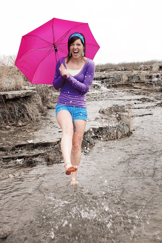
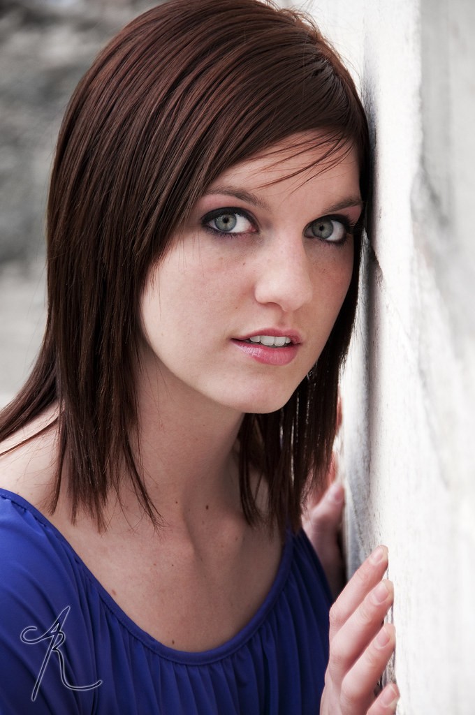
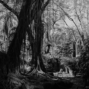
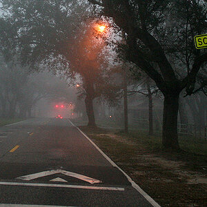
This was my first time shooting senior portraits and I'm just hoping to get some feedback and helpful critiques so that I can improve my work. Thanks!

4622164741_d80cbfe15a_b.jpg


4622159721_f62764efb4_b.jpg


4622761940_ab7946a01f_b.jpg


4622757308_a3d047305d_b.jpg


4622169107_d40802732f_b.jpg


4622778650_54c619a69b_b.jpg
 
You have a very nice,naturalistic style. Nothing overly processed or outlandish, with "realistic" looking skin tones and no overriding layer of noise reduction, no cutesy or clever Photoshop actions or filter effects. I like this kind of photography. The outdoor shots look like they were all shot under low-contrast,overcast outdoor lighting, so the lighting is almost shadowless; you could, if you wanted, bump up the contrast a little bit on the first photo, to give it just a little bit more snap.

On the second photo, the one with her feet in the air--her nose appears a bit too large, which looks to me like the result of using a bit too short of a focal length lens,from slightly too close a distance, causing the apparent perspective distortion on the nose. I do not see that same look in the last shot, the one where she's facing the white wall. The skin tones are ever so slightly too red in the last photo, especially on her hands. overall though, if this is your first-ever senior photo shoot, well, wow...quite decent.
 
#3 just plain rocks. I don't see anything I don't really like about any of them. But #3 just kicks ass.
 
Thank you, thank you, thank you! On the first one, I don't know what happened. When I uploaded it to flickr, the color and light is kind of off (well, it's like that for all of them), but I could go back and give it a little more contrast. Thanks for that suggestion.

I was using the same lens for both shots, my 18-250 and I took the laying down one at 135mm and the wall one at 116 mm. She (honestly) just has a kind of big nose and it's most noticeable from the side. I think it was the angle that her head was turned. But I hadn't noticed until you pointed it out, and I will try harder to keep people's features in mind the next time I'm photographing someone.

Thank you both for the opinions!
 
All look really good. The following I noticed
#1. Her right arm seems in an unnatural pose, maybe next time her hands should softly grip her shins.
#2 Its not this shot but be careful to avoid shooting down the blouse.
#3 Looks great to me
#4 Stray hairs across forehead.
#5 Ball is cut off
#6 I would kept top of head in shot.
All very minor so you can chose to ignore my comments at your leisure.
 
Wow! I think you did a fabulous job! I adore number 3. In number 1, I think your subject is too square with the camera...maybe just a smidge of an angle would help. I will be shooting my first set of senior pics next week...I hope mine turn out this well!!
 
I'm not a people photographer, so...

I love the pose in #1, but she didn't pull it off well.

The last one made me say "WOW!".

I do like the volley ball shot.


The umbrella shot is playfull, but I am not wowed by it.
 
I like these a lot!

The only one I didn't really like was #2 - I don't like the cropping or her expression.
 
Thank you all for the comments. =) For some reason I enjoy cutting off body parts. I know most people don't favor it, but if I'm shooting for just me I'll keep on doing it. I should probably not when I'm shooting for clients though. Thanks again!
 
These are good, the first two are less flattering photos of her, the rest look like a different girl.

I love the last shot with the wall, that was a good idea. I also like that you mixed it up and tried different things, the sports, playful, black and white - probably a bunch of other stuff that didn't make it to the forum.
 
Haha, yes. There were 21 final images all together. I didn't want to overwhelm everyone. XD What's funny is the first one is her absolute favorite. I think it would have been better if she hadn't been slouching though. =/

At least I know for next time.
 
I don't like the pose in #2. Number 3 is playful and color constrast, I like. Number 4 is good as well, but my favorite is number 4. WOW is right.

I love your processing style by the way. No plastic skins! :thumbup:
 
great shots, great inspiration and great pp! What are you using?
 
Yeah, I hate that super fake look!

Like equipment or for pp?
 

Most reactions

New Topics

Back
Top