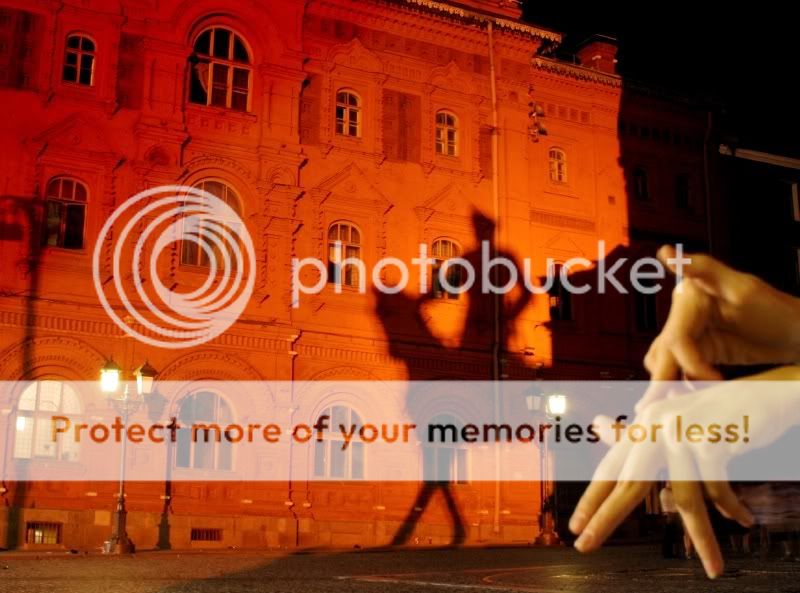
I think you have a good idea, but the background and the foreground don't really match though. It look like the hands don't belong in there...hope that help.
very very cool. its just this would have been a lot better if there was a more shallow DOF and the focus was on the hands. and a slightly tighter crop. i like the color of the building but the color of the hands is off. too green/yellow. very cool shot tho =0

")


![[No title]](/data/xfmg/thumbnail/34/34746-f8e4b50f9d9b0de43c95af3d2caf956b.jpg?1619736628)


![[No title]](/data/xfmg/thumbnail/38/38265-4b75e7e05f8bf906800580ac7f7ddf60.jpg?1619738549)

![[No title]](/data/xfmg/thumbnail/42/42054-e8278f89f6a543cad8fd644e37b064f3.jpg?1619739992)
