&Denekamp
TPF Noob!
I'm putting this one up for critique, because I'm not really sure of this one.
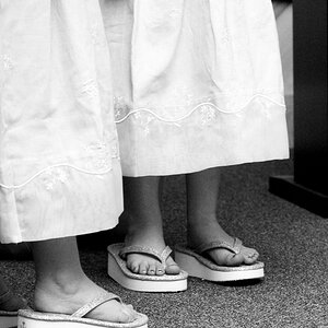
We had a tour through Globe theatre with the class, and afterwards we could walk around freely. All of my classmates were taken pictures of the stage and stuff. And I wanted to do something a little different. So I walked around a bit, and found this. I kinda like it.. but.. I dont know.. maybe the blur is to much?..
So thats why I would like to hear some of your oppinoins. Please tell me what you think about the DOF, composition (is it to much split in half? Is there to much difference between left and night? etc.), and any other comment or critique you have.
50mm @ f1.7
exposure somewhere around 1/60, 1/125 of a sec.

Thank you in advance
Niels
We had a tour through Globe theatre with the class, and afterwards we could walk around freely. All of my classmates were taken pictures of the stage and stuff. And I wanted to do something a little different. So I walked around a bit, and found this. I kinda like it.. but.. I dont know.. maybe the blur is to much?..
So thats why I would like to hear some of your oppinoins. Please tell me what you think about the DOF, composition (is it to much split in half? Is there to much difference between left and night? etc.), and any other comment or critique you have.
50mm @ f1.7
exposure somewhere around 1/60, 1/125 of a sec.
Thank you in advance
Niels


![[No title]](/data/xfmg/thumbnail/37/37534-e0f67d1d14bd79cca15937359f0e4c94.jpg?1619738132)
![[No title]](/data/xfmg/thumbnail/37/37536-3578b4f283f738d862be62d896fa52d5.jpg?1619738132)

![[No title]](/data/xfmg/thumbnail/37/37535-0e9dcff8bc21e85b84fa89af160ac8d5.jpg?1619738132)