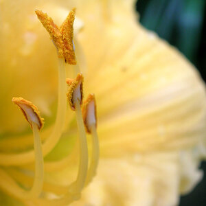
The thing I love the most about the first one is the reflection and the wet look the surface the daisy is on.
The second one, i like the placements of the petals as well. but I think there are too many.
the second one has a brighter...daisy center (?) but it's too bright. The first one i fine, but maybe could be a little brighter.
The second one has too muhc room at the top. I like the crop on the second one (at the top). I like the space on the left hand side on the first one,a nd the angle of the daisy on the first one.
I like the composition and the amount of pedals in the first one. I don't however like the reflections, makes it look too fake and studio-done to me. I agree, there is too much space at the top of the second. But I do like having the daisy off to the right, instead of centered.
Nice pictures pilgram. I like the first one as well. For me the reflection works for this picture. The second one seems a little dull without the reflection. I also seems like it's floating especially that left side because there's no ground reference point.


![[No title]](/data/xfmg/thumbnail/40/40285-2ce5915035c220ccb3485030863b62d0.jpg?1619739408)

![[No title]](/data/xfmg/thumbnail/40/40284-f59f6230f0d5b9eacf977f8b0392f087.jpg?1619739407)