Another voice saying #3 is my fave. I prefer the composition in 3, with the rotting 'ribs' in the foreground not extending up as high as in #4, and the angle at which the boat is positioned. The b/w treatment works really well too.
Number four, I think, is the winner. And I wouldn't touch the contrast on it. The tones are great, and there is both shadow and highlight detail. Very smooth.
Only thing I might suggest trying is burning the corners a bit, and the top of the cabin. Perhaps the edges of the frame, as well. Upper left corner, in particular, is pretty bright.
I also like the first, with the wreck in the far distance. It is a bit centred in 1, but you have to look and look for it. I like that.
Somehow it also reminds me of a children's poem I used to know when I was little and used to read out to my kids when they were little, but telling you about that one is no use --- it is in German . But it was about a ship (not all wrecked as yet) out of use and only sitting somewhere, and how that ship dreams of going to faraway lands and such...
Ooops... sorry, I increased the contrast on the wrong one.
Thanks for all the feedback everyone. It's greatly appreciated. I think the downfall of the last two is the sky. You say I should burn that...? Does that just darken it or do something else? Thanks...
Ooops... sorry, I increased the contrast on the wrong one.
Thanks for all the feedback everyone. It's greatly appreciated. I think the downfall of the last two is the sky. You say I should burn that...? Does that just darken it or do something else? Thanks...
Burning makes it darker. The term comes from the darkroom process of increasing exposure on an area of the print, making it darker in that area, while leaving the rest as-is. With negative films, this can also bring out more detail in the bright areas; not sure whether this will work for digital captures, or how well it will work for scanned negatives, and it usually won't work for scanned prints. Someone with more experience in digital work can probably clear that up.


") . But it was about a ship (not all wrecked as yet) out of use and only sitting somewhere, and how that ship dreams of going to faraway lands and such...
. But it was about a ship (not all wrecked as yet) out of use and only sitting somewhere, and how that ship dreams of going to faraway lands and such... 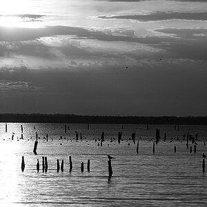
![[No title]](/data/xfmg/thumbnail/37/37526-bc41ead4d3f2330d3e37da95abf9132e.jpg?1619738130)


![[No title]](/data/xfmg/thumbnail/30/30867-a58aa3d7c15d0b48498a201af3a68a8f.jpg?1619734485)
![[No title]](/data/xfmg/thumbnail/38/38293-15e3a85f038b239e3c60bf9f38f5d56c.jpg?1619738563)