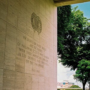
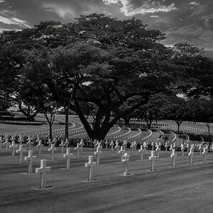
" SHOOTING THE HARBOR BLDG. "

Joined
May 13, 2007
Messages
453
Reaction score
0
Location
Vermont
Can others edit my Photos
Photos NOT OK to edit
Two Shots of the Customs Building and Boat House, One in Vertical, and one in Horizontal... WHICH ONE WORKS FOR YOU ?? Either or Neither?

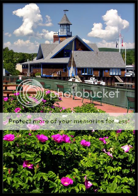
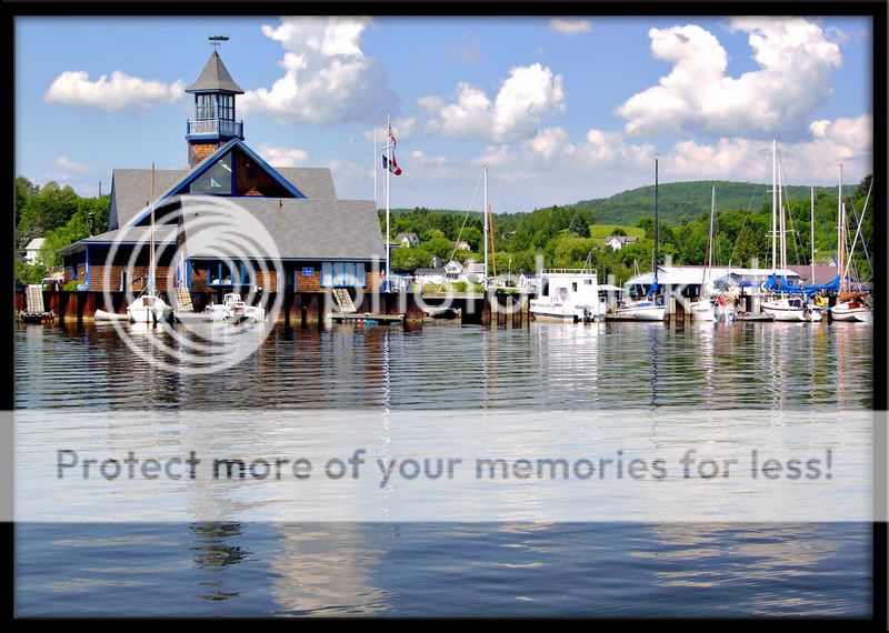
Like to hear reasons for or against ...


  • Focal length: 17.8mm (35mm equivalent: 70mm)
  • Exposure time: 0.0073 s (1/137)
  • Aperture: f/4.7
  • ISO equiv.: 50
HarborBldgUSCustoms.jpg


  • Focal length: 17.8mm (35mm equivalent: 70mm)
  • Exposure time: 0.0053 s (1/188)
  • Aperture: f/5.2
  • ISO equiv.: 50
smalltownharbor1.jpg
 
In both of these, the blue trim and blue sails seems gaudy and oversaturated.
It completely distracts the eye.
 
hdukphotographs.... I thank you for that.. Appreciated..

The Traveler.... not really over saturated, that is some really bright blue going on with that trim.. everyone that goes to the harbor comments on that lol... some like, some don't .. Thanks


PNA... well your not seeing things... as said above.. That Blue is pure Wild, but ya can't miss the harbor either lol... Thanks for commenting..
 
Well given a choice between the 2 pictures presented I think I would have to pick the one with the flowers. I think it is a better angle on the building and the flowers add more interst than the water.
 
Both images have problems.
From the title and your initial post it appears that the main subject of both images is the harbour building. But it isn't really the main subject in either one.
The first one has the bright green bushes with magenta flowers in the foreground taking up half of the image area. Nice though they are they dominate the picture. At the same time the building is at the top with the weather vane almost bumping the top of frame. It makes the building seem as if it is being squeezed up out of the picture, relegating it to second place.
You need to lose half of the bushes and put more sky over the building. This will reduce the dominance of the bushes and bring the building back to being the main focus of attention.
The second image has a similar problem. This time the building is being squeezed into the top left. The vast expanse of water has no real function, not contributing to the image but (like the bush) still dominates.
Less water and more sky.
Both are OK as general views but if the building is supposed to be the important element than you have to make sure that it is dominant visually.
 
jip... Hey thanks for commenting, and the view of pics!

Hertz... thanks for your comments... I understand what your saying, more so on second photo though in my opinion... I didn't really want all that water, but no real foreground interest at this POV... Actually the Bldg is the subject, but guess I like my window dressing too lol.. maybe a bit carried away... but again thanks for taking the time with comments!
 
The second one is the winner for me. The First one really doesn't do a whole lot for me. I want to look at the boat house...but then i want to look at the flower/bush in the front. Perhaps even too much of the flower/bush in the shot?

I also love shots of water and boats...so I may be biased. Both are very vibrant and colorful though.

(Where are these taken??) It looks like a New England Lake.
 
Try cropping about a fifth off the bottom of the first one - up to the 'line' of flowers.
Just scroll the window to do the crop.
You should see that it pulls the building back in.
 
Timbo..... Thank you... These are in Vermont.. Way up at the top,, Lake Mephremagog... part Canada/ U.S. part of bldg in pic is actually customs..

Hertz... Hey.... I can see what your saying... probably is a little overkill on foreground flowers...
 
I love the lines and the depth of the first shot but the scene in the second shot is amazing.

Quick question: How did you make the edge of the image appear to wrap around onto the black border behind?
 
The Traveler.... not really over saturated, that is some really bright blue going on with that trim.. everyone that goes to the harbor comments on that lol... some like, some don't ..

Do people buy sail covers to match the blue paint? They seem equally as bright as the paint.

If the blue is so bright as to overbalance the other colors, I would tone it down to make the picture better.
 
Ok, lets back it off a notch... how bout this , can ya live with this traveler??

I do think it mellowed the blue, and also, gives a better white??


Harborredo.jpg
 

Most reactions

Back
Top