Shots for a calender I recently did. Slightly NSFW, Harsh C&C?

themedicine

TPF Noob!
Joined
Dec 29, 2009
Messages
431
Reaction score
6
Location
Roanoke, VA
Website
www.wix.com
Can others edit my Photos
Photos NOT OK to edit
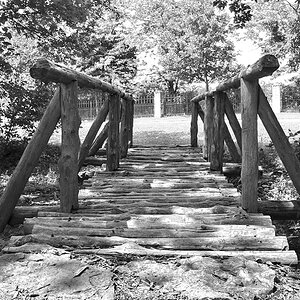
So i did some friends of mine a favor and shot a calender for them for free. I learned quite a bit about lighting and such from these shoots but I learned way more about clients. haha, especially when they are your "friends" but anyway, here they are, in all their glory. If there is any explaining I need to do ill do it below the photo in question.

January-
4248480375_4ae36958a9_b.jpg


February-
4249255696_2fe0d7862d_b.jpg


March-
4249251570_5bbb116fdd_b.jpg


April-
4249252668_8fb1e5893a_b.jpg


May-
4236373870_84399d770b_b.jpg


June-
4248478317_c7d9bc5a2e_b.jpg


July-
4248475309_bab9dee924_b.jpg


August-
4249251054_5d1ab2e394_b.jpg


September-
4249253928_a35f2af59a_b.jpg


October-
4249251878_9a07bc6cde_b.jpg

The big gap up top was left that way for a special thanks/ad section.

November-
4249254532_170dc09839_b.jpg


December-
4248479977_274d7c7a36_b.jpg


Ok, there it is. Calender girls girls girls.
Like I said, I want EVERYONE'S honest C&C on these. I need to grow!
TIA!
-josh
 
I think January looks good. Lighting seems to be just right.

Did you photochop February to thin her out? Her belly and back silhouette lines look wavy.

November looks slightly over saturated.

Bad nose shadow on August.

I like April, except I wish it was composed differently. Maybe off-center?

Love June's contrast.

May's face looks soft... maybe out of focus.


Just my opinions..
 
Thanks! in response, February actually wasn't photoshoped to thin her out, thats her...odd lighting? in contrast, September WAS photoshoped to be thinner. but she is the only one. November was actually cooled a little bit, shes a bit orange in real life! haha, but i should have toned her down some more then.
good eye on august's nose shadow, and the rest i agree with as well. Thanks again!
 
Can you do a calender of just April? :mrgreen:
 
Okay,

January: You see how her hair fades into the black background? I don't know if that was intentional or not, but if it wasn't, a kicker light coming in from above her (and/or off to one of the sides if you like) would help give her a little more separation from the background.

February: Her hands are still in the spill of the key light, but definitely at it's edge which is what's causing them to be significantly darker and grayer than the rest of the skin tones.

March: The light on her is kind of harsh and causing unflattering shine/hotspots on her forehead, and nose. Plus, it's coming in from a downward angle casting an odd distracting shadow on her neck and upper chest.

April: I'm assuming you want that sign in photo, but without context, it is distracting and pulls my attention more than the model does. There's also a big lens flare on the right side of the sign that detracts from the photo.

May: Very busy background is distracting. Some of the negative space above her head could be removed by lowering the camera to capture her feet. The background could be de-emphasized by cropping in to make her fill the frame more and still have enough of the diner to show the photo's context

June: Those hotspots on the posters pull the eye there. This is an instance where you could have taken two shots, one with the model and the lights and the other without the lights and then blended them. Or, you could have used gobos or barndoors to avoid the spill of light onto the posters.

July: Not a fan of the angle or the sign... I spent more time reading the sign and trying to figure out what it had to do with the photo than I did looking at the model.

August: The upward lighting is causing a horrible nose shadow on her right eye. The light is also very harsh and causing her skin to be a little washed out.

September: Very busy background again that could be addressed with a tighter crop. Also, the light is harsh and causing distracting shine/hotspots on her face.

October: This one, too, could use a kicker light to give their heads a little bit more separation from the background. Especially the model on the left's hair which is fading into the backdrop.

November: Harsh lighting again causing distracting hotspots and emphasizing the tanlines.

December: Her abdomen and leg is where the primary spill from the key light is and her face is significantly darker.

I didn't spend as much time looking at composition as I did on lighting and exposure. Twelve pics is a lot to give targeted C&C on.
 
With just a quick look, the one major thing that stands out for C&C is the nose shadow for Miss August. That kills the shot for me.
 
right on Pugs. all extremely good points. No need for me to justify anything cause you covered alot of bases. anything good to report? haha.

@manicmike, sorry, i dont know if she would be down for another shoot. That one was very fun though, we had a truck driver drive by like 3 times honking the horn. fortunately though, there were enough of us there the scatter any would be creepers.

@big mike, yea, seems to be the consensus on that one! haha. i do like her skin tones though, personally, but wish i would have done lighting on a different angle.
 
right on Pugs. all extremely good points. No need for me to justify anything cause you covered alot of bases. anything good to report? haha.

Yeah, that's why I apologized for not spending more time on the compostional aspects. They're all quirky, interesting, and atypical. That's a good thing. The composition, except for a few busy backgrounds and odd camera perspectives are for the most part strong and interesting.
 
nothing from you though? no thoughts or comments? glad you could learn some stuff today though!
 

Most reactions

Back
Top