Navigation
Install the app
How to install the app on iOS
Follow along with the video below to see how to install our site as a web app on your home screen.

Note: This feature currently requires accessing the site using the built-in Safari browser.
More options
You are using an out of date browser. It may not display this or other websites correctly.
You should upgrade or use an alternative browser.
You should upgrade or use an alternative browser.
Shots with GF...C&C
- Thread starter wmc1117
- Start date
")
silverbody
TPF Noob!
- Joined
- May 20, 2009
- Messages
- 29
- Reaction score
- 0
- Can others edit my Photos
- Photos OK to edit
where do you live?
#3 is a fave
#3 is a fave
paulk_68
TPF Noob!
- Joined
- Feb 14, 2009
- Messages
- 229
- Reaction score
- 0
- Location
- New York
- Website
- paulkphotos.com
- Can others edit my Photos
- Photos NOT OK to edit
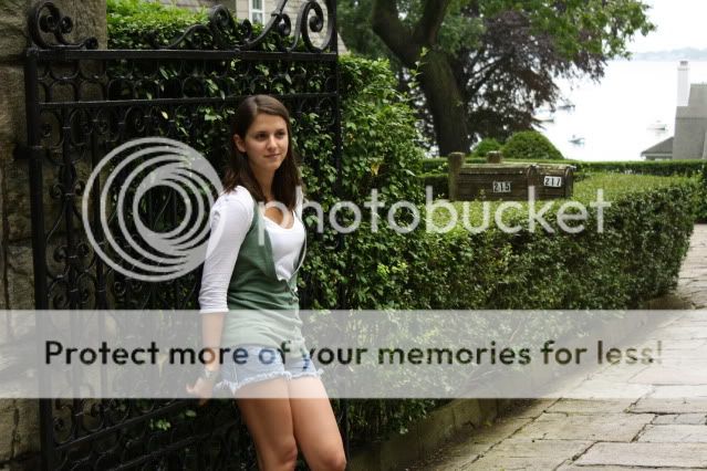
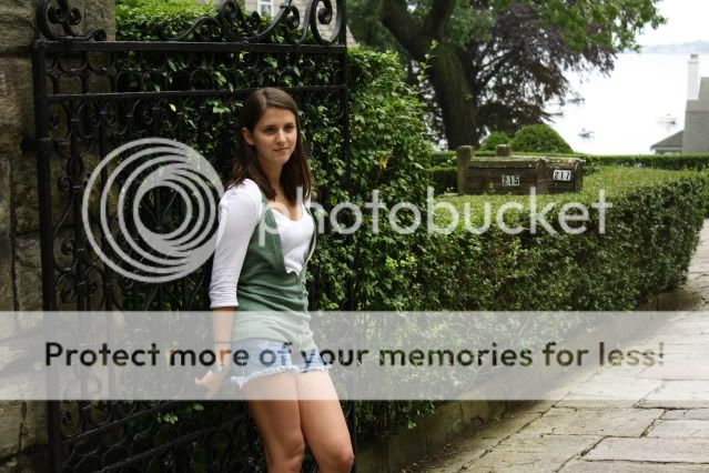
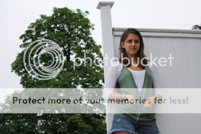
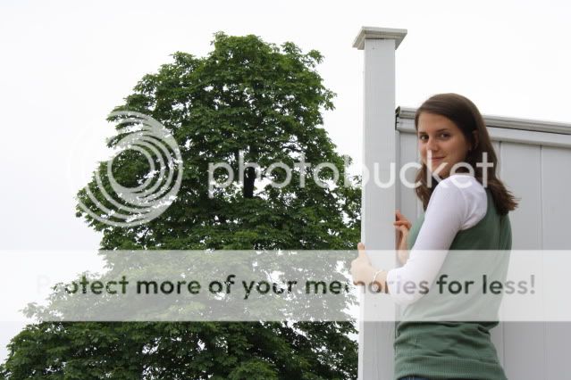
They all look good. Not really knowing what you were after, I would say that they all would look better as tighter vertical crops.
They all look good. Not really knowing what you were after, I would say that they all would look better as tighter vertical crops.
If you don't mind me asking where would you crop them vertically?
paulk_68
TPF Noob!
- Joined
- Feb 14, 2009
- Messages
- 229
- Reaction score
- 0
- Location
- New York
- Website
- paulkphotos.com
- Can others edit my Photos
- Photos NOT OK to edit
They all look good. Not really knowing what you were after, I would say that they all would look better as tighter vertical crops.
If you don't mind me asking where would you crop them vertically?
In all four of them I would crop just above your girlfriends head. In the first three I would leave a little more space on the right side of her, and the last image I would leave a little more space on the left.
Baaaark
TPF Noob!
- Joined
- May 27, 2009
- Messages
- 414
- Reaction score
- 0
- Location
- North or South Pole... it depends
- Can others edit my Photos
- Photos OK to edit
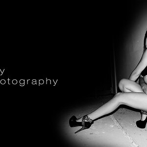
I was drawn to her legs, and where the photo was cut off. If you're going to put her legs in the photo, put ALL of her legs in the photo. When you only include part of them, it doesn't seem as natural, you know?
In all of these photos, I would have gone the opposite way and actually included her whole body. Number four, concerning her, is nice though. Cause it includes all of her shirt, and none of her shorts, it looks natural.
When you're looking at a photo, look at the subject as if he/she were parts. Like her shirt is a part, her arms, her shorts/pants, her legs, etc. If you're going to include one of these parts in the photo, either include all of it, or none/almost none of it. Some people may be able to clarify more, but when we see a photo we break it down into parts. And these parts need to either be in the photo or out.
Great stuff, though. IMO with more experience and more trial and error, you are going to be GREAT.
They all look good. Not really knowing what you were after, I would say that they all would look better as tighter vertical crops.
If you don't mind me asking where would you crop them vertically?
In all four of them I would crop just above your girlfriends head. In the first three I would leave a little more space on the right side of her, and the last image I would leave a little more space on the left.
When you say leave a little more space on the sides do you mean if I were to take the picture again?
paulk_68
TPF Noob!
- Joined
- Feb 14, 2009
- Messages
- 229
- Reaction score
- 0
- Location
- New York
- Website
- paulkphotos.com
- Can others edit my Photos
- Photos NOT OK to edit
If you don't mind me asking where would you crop them vertically?
In all four of them I would crop just above your girlfriends head. In the first three I would leave a little more space on the right side of her, and the last image I would leave a little more space on the left.
When you say leave a little more space on the sides do you mean if I were to take the picture again?
You could do it now to experiment, and then apply what you like to the next time you take more ''people pictures.'' Save the originals if you plan on making large prints of them.
kundalini
Been spending a lot of time on here!
- Joined
- Jul 18, 2007
- Messages
- 13,607
- Reaction score
- 1,937
- Location
- State of Confusion
- Can others edit my Photos
- Photos NOT OK to edit
Taking Baaaark's comment a bit further, do not crop (in camera or in post) close to the joints. So IMO, #1 & 2 have the crop too close to the knee. One fix might be to crop around mid-thigh, maybe slightly lower. Also, the blown out harbor draws the eye away from your model, so cropping that out as well would bring her closer in the image.
#3 & 4 has the top of the fence cutting through her head....... not a pleasing thing to my eyes. When faced with grey, featureless skies as in these, try to not include it. A higher PoV would have avoided this.
Typically, I'm not a fan of the wall flower look. Next time try having her step away from the background (5 to 8'), open up your apeture and she should visually pop more in the image.
All could have benefitted with fill flash.
Just my 2¢.
Thank you Kundalini for your input...good stuff to keep in mind for future portraits. In 1 and 2 I was kinda bummed that the water in the background was kinda blown out because of the overcast day. Any advice on how I could of maybe got that to be more visually appealing if I was trying to keep the water in the background?
kundalini
Been spending a lot of time on here!
- Joined
- Jul 18, 2007
- Messages
- 13,607
- Reaction score
- 1,937
- Location
- State of Confusion
- Can others edit my Photos
- Photos NOT OK to edit
Possibly a circular polarizer filter could have helped, but it looks like a pretty wide dynamic range you're dealing with. Meter for the harbor, then have an external flash to fill in for your model is probably a good approach.
A lot of people say they want to use natural light only. That's because they don't understand lighting. Have another look at your photos. These are meant to be protraits, yes? So the face and particularly the eyes are of the utmost importance. Each one of yours have her eyes in shadow. Redirecting the light with a reflector or using flash are the only solutions I can think of to improve the results.
A lot of people say they want to use natural light only. That's because they don't understand lighting. Have another look at your photos. These are meant to be protraits, yes? So the face and particularly the eyes are of the utmost importance. Each one of yours have her eyes in shadow. Redirecting the light with a reflector or using flash are the only solutions I can think of to improve the results.
Josh220
No longer a newbie, moving up!
- Joined
- May 23, 2009
- Messages
- 1,730
- Reaction score
- 83
- Location
- California
- Can others edit my Photos
- Photos NOT OK to edit
Not bad, I like them. I just did my first portraits the other day, and I used my gf as the subject too. Obviously we both have room to improve, but I think your shots are a good start.
This was my attempt:
http://www.thephotoforum.com/forum/...forum-photo-gallery/168645-portraits-c-c.html
The only thing I recommend is doing it in the shade (or overcast day like you did) and have a flash. Also try cropping it tighter around the subject, and in the future get a little closer (or zoom in closer). It'll help it look more like a portrait and less like a snapshot of her.
Most reactions
-
 428
428 -
 290
290 -
 285
285 -
 271
271 -
 221
221 -
 204
204 -
 185
185 -
 179
179 -
 167
167 -
 166
166 -
 148
148 -
 133
133 -
 120
120 -
 95
95 -
I
94

![[No title]](/data/xfmg/thumbnail/31/31743-3b294ee78fc71e7bfc025b01eafb0c2d.jpg?1619734986)


![[No title]](/data/xfmg/thumbnail/38/38750-dbafc867a1461ce200c2405640d537ec.jpg?1619738704)