Siblings shoot.. C & C please

OnlyAGlimmer

TPF Noob!
Joined
Mar 24, 2008
Messages
33
Reaction score
0
If this should be in the professional section feel free to move it!


I'm still very new to taking pictures for others so I would love some critique :)

#1
replace1.jpg


#2
395175270_z97fD-L.jpg


#3
395178622_SnE92-L.jpg


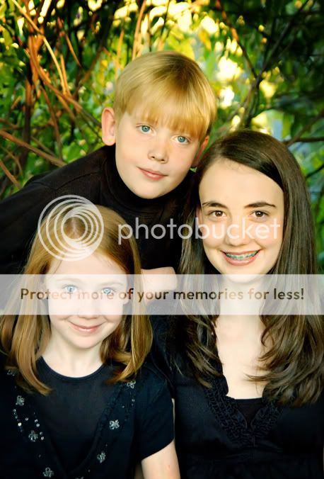
#4 (I know I should have made sure the boys head was more visible)
395178612_4wFpU-L.jpg


#5 (I know I didn't leave enough space at the bottom and the boys hands are badly positioned)
395175253_zY4da-L.jpg


so... any helpful critique? :)
 
Last edited:
I think you had some fun ideas. Nice job. #3 is my favorite.
 
Well, 'helpful' is a rather subjective term, but I'll offer my thoughts. Overall, you've got some really nice images. In #1 the skin tones seem just a little bright, #2 especially is well done, particularily with the challenging lighting conditions you had. I think the highlights and skin tones in #3 might benefit from a little more work esp the areas camera left which seem just a little over bright. My big complaint however is with you backgrounds. It's never a good idea to have trees, telephone poles, et cetera, "growing" out of peoples heads, but in 1, 2, and 5 that's what you've got.

In all cases I think this could have been avoided just by moving the subjects a little further to camera right. I'd also suggest a shallower DoF (Your EXIF data is incomplete so I don't know what lens or aperture you were using). The backgrounds in 1, 2, and 4 are too focused and busy, distracting the eye from the subjects. If you don't have something like a 1.4, try using long glass and place yourself a little further away. Telephotos have much less DoF than wider angle lenses and this will result in a much softer, less distracting background.

Just my $00.02 worth - your mileage may vary.

~John
 
Thanks! My shallowest DoF is 2.8 so it's as good as it could get on the DoF :) Hopefully within the next 3 months I'll be getting at least a 1.8 lens. I also don't have a good telephoto lens. Thanks though! I totally agree. Looking at them I know there was one spot I could have put them where they would have been farther away from the background. (I had to seek out shade and most of the time there was something directly behind it)

off to edit some of the skin tones and the light in #3.
 
okay, a slight edit on #1

I blurred the background a bit, darkened the skin tone.. but I think I've got it to red now LOL
395633749_qAYA2-L.jpg
 
The light seems very uneven across their faces in #1. The girl on the right (our right) has red cheeks with what appear to be hot spots, and then her neck is grayish. The girl on the left seems to have cyan in her forehead and neck. I personally seek out even light (not necessarily flat, although I do love that too).
You have some cute poses here. :)
 
I love #3. I think you have some really good ideas and poses! I could be wrong because I'm on my laptop so I don't trust it completely but it seems there might be some minor WB issues (especially #1).
 
Cute poses! My favorites are #2 & 3. Overall, there is a slight white balance issue but that can easily be corrected. The faces are a tad washed out on a couple of them but, honestly, not that bad at all, imo. I'm guessing that lighting was a bit challenging.

After white balance is fixed, I really like the series!

This is the white balance corrected a little in #2-does that help?

395175270_z97fD-L.jpg
 
thanks guys! They just placed a large order so I think they were pleased. :)

I did correct the wb in most of them.. I'll have to post the updates when I get a change. :)

A&A_Lane I think their true skin tones are somewhere between my edit and yours :wink: I think I finally got it after alot of tweaking LOL
 

Most reactions

Back
Top