Silhouettes First time :S

Moni

TPF Noob!
Joined
Feb 20, 2004
Messages
361
Reaction score
0
Location
Chittagong
Website
www.myspace.com
Can others edit my Photos
Photos OK to edit
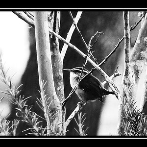
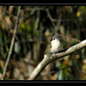
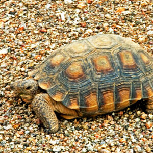
Little distort may be beside the head I think......
Don't know any good technique to take such photos in Sun :S

boybksun.jpg
 
I really like the hazing/misty feel to this photo. Also the orange hue adds a nice warming touch. I actually like the distortion next to his head. It adds to whole theme and feel of the photo. The only thing I would be picky about would be to have a tighter crop next time, but that could just be me. Nice work, Moni.
 
Very nice shot. That bright sun gave it that Harpper was talking of I would guess, which I like, makes it also seem like he's in a really dry dusty place, like on the edge of a desert and we don't see it cause he's facing it. I'm not sure if that makes any sense, but it makes me need a drink! Heh heh, nice work :)
 
I like this, but I think that the very bright sky hurts the eyes a little.
The slanting morning sun gives this photo its special effect, admittedly, but there's too much of the sky to be seen.
And the "silhouette" isn't QUITE one, there are traces of the boy's face to be seen, and this is tearing me now between wanting to see his face and wanting to have just a black silhouette... I'm quite undecided here.
The scene as such, though, and the way you caught it, is appealing.
 
i like the haze, but the bg light is a little intense. i REALLY like the content.. i think you should take more like this!!
 
hi moni, very nice photo, looks like you have some good comments here.

The thing that I would have done different is frame the boy between the 'wedge' between the trees. As it is now, a the silouette of the boys head competes with the trees in the background. Move him slightly to the left, and then you have more of a distinction because the boys head in up against the sky. Also try another angle where the sun is directly behind the boys head or walking staff.

Another thing, having the large staff here so close to the center divides the picture into sections, i think moving it a bit to the left may also help the composition.

excellent theme, and its a nice shot moni :)
 
The light didn't bother me at first but when I looked at the picture at night time it became too bright. During the day when I have light coming through my window, the picture's lighting seems to work. You probably should change it judging by other people's reactions.
 
hi moni!
what a nice shot!
i could be a little picky about the eyes (as La Foto said...and a litttle little about moving the boy to the center -;))..but i won't be...for a first time!!!
this is a really sensitive shot, moni! :) :) :)
 
Aha...thanks Anja for your nice and inspiring comments....

Hey, as I said before...Mark really really really a very good photography teacher over here...and a nice jolly person...who loves sci-fi...and will tell Peter Jackson about me ;)

Any way...thanks to others also...harpper....yeap you and Lafoto are correct about the lightl...and I know about the face ... that I should completely keep it in dark :S but actually what I wanted to give it a mysterious look...something shown some thing not ;)

and thanks to Lafarmer and simul for liking it very much :)
 

Most reactions

New Topics

Back
Top