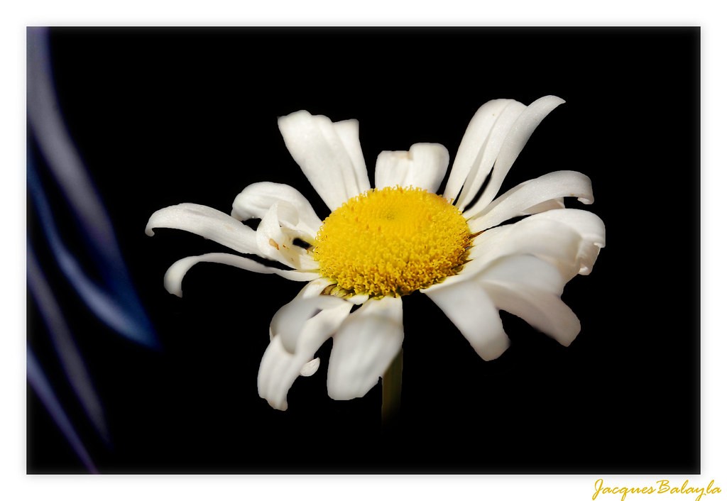
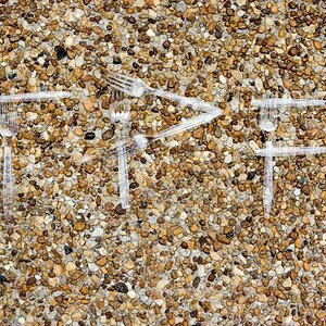
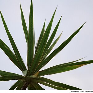
Take for example the stool/chair. The exposure is fine technically, but if you look at the seat, there's quite a glare/shadow pattern. I would suggest a much softer, more diffuse light to avoid this, and consider perhaps under-exposing a little bit as well (I'd also recommend cloning out the little bits of things image left). In the case of the matchsticks, the paper over the matches in teh foreground is quite bright and there are highlights on the matches, again, soft diffuse light. The daisy is nice, but I'd guess about 1/2 stop over-exposed; there's virtually no detail in the white petals. The last one (telephone/arms) has rather too many elements in it to be "simple" to me, however, bear in mind that the definitions of such terms are purely subjective. Technically your images are fine, but you and I may not see 'simple' in quite the same way. Apologies for the original, uninformative and abrupt post. I was in a bit of a hurry at that point.
Nice photos but simplicity is far from what I would call them. Every single photo has elements that would keep me from using that term.
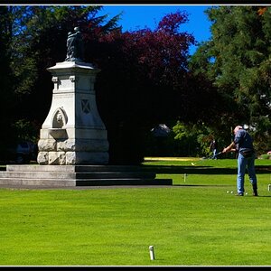
The first one has a lot of different lines, textures and colors to be called simple.
The chair is close, but the back has a lot of pattern that draws my eye away from a simple feeling. Maybe a backless stool would feel more simple.
The flower with the petals going kind of "wild" and not smooth like a lot of flowers brings this one away from simplicity.....as well as the color blur on the right.
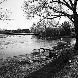
The last one has too much going on for simple. The phone, two arms, desk, monitor, out of focus words. Maybe a phone on a white desk by itself with a more blurred out background would have brought out the simplicity.
Subject wise these photos are far from simple, in fact I think only chair and the flower constitute simplisity, maybe the first one, but there is something going on there that I don't understand be it in camera or in post I dunno.
The match box it has a tonal range failure but, I like it. However it is a more complex BW than I would expect under the title of simplisity. Here you will find an example of simplisity, or atleast what I deem simplisity.
*EDIT dammit Nate :lmao: you said the same thing I said wile I was posting...If I hadn't spent twenty minuets looking sor that example....
Keep in mind, especially with display in this mannor, the title is the first impression and can make or break the reaction to the photo, a good photo with a bad title can potententally go completely awry, conversely a bad photo with a steller title could potentially become an epic winner simply due to what mind set the title inspires in the viewer before fiewing.
Very True. Plus, sometimes it's hard to come up with a good title. Plus a catchy title can determine whether a lot of people will even click into the thread.


")
![[No title]](/data/xfmg/thumbnail/42/42327-560f11a37bb209e9091c0fc9e1028cdc.jpg?1619740128)
![[No title]](/data/xfmg/thumbnail/31/31096-b9b8d52b45753cd4f9251832149ef9da.jpg?1619734613)

![[No title]](/data/xfmg/thumbnail/42/42397-30faa170de7ed9be38adf00b9b26a220.jpg?1619740167)
![[No title]](/data/xfmg/thumbnail/36/36132-5bd4fa365c199003273e0ff128bf42f4.jpg?1619737384)
![[No title]](/data/xfmg/thumbnail/41/41493-60071420f928565170996b4edc3de2f0.jpg?1619739820)
![[No title]](/data/xfmg/thumbnail/38/38263-ad5e4c9e677626ddb5b1e7cdf9ebe40e.jpg?1619738548)