Sittin' at a bar on the outside-Project-(BESP)

Natural_Disaster

TPF Noob!
Joined
Feb 4, 2010
Messages
229
Reaction score
0
Location
Noth Carolina
Website
www.flickr.com
Can others edit my Photos
Photos OK to edit
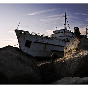
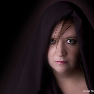
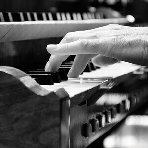
Attempted to set a scene kind of like an outside beach bar at sundown.
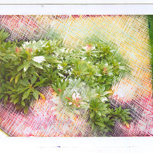
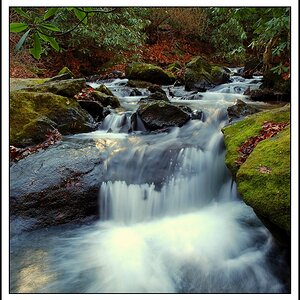
With the cold wet weather we have been having, my only option was to try for something inside. And honestly, in my house that still doesn't leave a lot of options.

Nikon D5000
55-200mm-1/2000-4.8-ISO320
Taken in kitchen with light from living room to the left, florescent in kitchen behind me, and candle.

Editing-Crop, sharpening, contrast up a notch, brightness down a notch, red toned down, noise reduction.

I see several flaws but will wait for C&C :confused:

4412687179_24cdafc827_o.jpg
 
What does the "BESP" in your title stand for?

I find this a tad too tightly cropped, I wish all of the shell were in the frame, and some more of the lantern in the background, as it seems to be quite an important background element with its amount of black.

I'm not too fond of the shadows, so you would need to work on your lighting in order to make this look like it was taken outdoors on a warm night around sunset. Only lamp light leaves shadows like this, the setting sun wouldn't (though I'm unable to explain to you in words what those shadows would really look like - it's just the feeling I'm having).
 
Good job.

Yes you took me for a second to the beach. The orange general tone and the background used made a good combination. I would not think this was taken in the kitchen.

There are some participants in the set up that were cut (shell, lantern) that make you think if you did it on purpose. I wish they were in. The cups shadow ..... was it on purpose or a challenge to get rid of it? Also is it a typo or the speed was really 1/2000?

I like the use of the space and the distribution of the elements in the picture. I feel they are balanced. Each one is telling you a bit of the story you wanted to describe.

Congrats.
 
Nice work, I think overall the photos was done good with all our project requirement in mind.

I think some more color would help and its a bit too orangeish since the background, table, and drink have a very similar color tone.
 
You have many "subjects" in the shot and I definitely see what you were going for, but I feel like you missed it. I think this setup could have worked and perhaps you would be willing to take another shot at it. As you said yourself, I also see several things wrong with the shot.

The thing that is most distracting is the front lighting. The lighting itself is harsh and almost directly behind the camera which makes everything fairly boring to me. I would like to see the affect of the light coming from the candle but the scene is way too bright for that. Some suggestions would be to move the light, diffuse it, or completely do away with it. I wonder what this shot would look like if the ONLY source of light was the candle.

The horizon is tilted ever so slightly.

The shell is chopped off and the lamp and orange slice are cropped too closely to the edges.

Is that a power cord I see or is that the base of the lamp? It's an element that shouldn't be there.

Overall, I feel like your composition suffered from the same thing mind did... everything is spaced out kind of haphazardly with no flow. Like Bitter rearranged the subjects in my shot, I'd recommend you do the same... try spacing them closer together so a stronger connection is made between them.

Finally, the salt on the rim, which I think is probably the most important part of making a drink look good, appears to be OOF.

Hope this helps.
 
Thanks everyone.
I actually do not like the orange tone, but couldn't get anything i liked better.
I agree the shell and lantern shouldn't have been cropped out so much, however i was working with limited space and a small background....
The black circular is the base of the lantern.
And yeah, the salt is out of focus. I tried to sharpen a bit but couldn't do much without a lot of noise.
Again, thanks for everyone's comments. Id love to re-shoot this, but it may be a few days!
 
To me, the margarita blends in too much with the basket weave in the backgroung. Also, it looks tilted to me.
 
Yeah I agree with everyone else. Its a nice idea but the drink blends into the background to much. It looks like the horizon is slightly tilted to the right as well.

Id try using a different background if possible or a different color drink.
 
I cannot find the focal point, everything looks fuzy, maybe the stem of the glass? It might be that the glass is frosted, or that there is too many things in the shot, but Its too simple, doesnt look like much thought was put into the composition.
 
It does look tilted to me now....
Yes there is frost on the glass.
I was going to do a red drink, but i used it all before i got anything i would even consider posting...So that's all i had left. I tried to make crushed ice, but when i put it in the freezer to keep it slushy while i got everything else ready, it froze together...so i tried to break ti apart...to give it more texture, but it didn't work as planned.
I admit, i knew before i posted that i didn't get what i was aiming for, but after about 100 attempts through 3 days, i didn't know what else to try...so....Thanks for all the C&C...Hopefully ill learn from it and do much better with the next project!
 
Nice effort put into this. :thumbup: There is a lot to think about when doing a still life.

You definitely need to think about color in the image, to make your main subject stand out. The image is out of focus. You need to bring your elements into the frame. Too much was cut off, or too close to the edge.

Part of this projects requirement, was to have interest in 3 of the 4 sweet spots, or golden sections, of the rule of thirds. I don't think you achieved it. This same set up might have been more successful shot in landscape orientation. The drink itself could have hit 2 of the sweet spots, and the plate of fruit could have been brought up and to the left to be more in focus to hit the 3rd spot.

What light caused the hard shadow? Did you try to difuse it?

Did you enjoy the project? Did you find it more challenging once you got into than you first thought? What did you learn from this exercise?
 
I think the white balance is off, and the angle could be fixed.

Nice idea, however i think the composition could be fixed a bit more as well

Try and cut the shadows a bit more, and the lamp in the background is distracting, try having a solid background, it helps to accent your subject.
 
I had my grid on and came closer to hitting the spots before i cropped, however, as i said above, i had limited space and small background to work with so it was either squash everything together in less than 2 feet of space (width) or crop some out..Or else you would have seen my walls, curtains, china cabinet, etc.
Again lighting was just overhead lights and the lantern. I tried shooting from different angles to relief some of the shadows but again, too much in the background to get anything to the sides. I tried turning on lights over the table, and tried flash to brighten it up hoping to get rid of the shadows..but it didn't work. Work lights would have been too bright.
Someone told me once to hold a tissue over the flash...I didn't think of it at the time. Would that have helped the shadows and kept it from blowing it out?
I did enjoy the project, however to be honest, i was bummed with my result.
I think i could have done a better job if i had the more free time during the day when i could have opened curtains and used more natural light. I am a complete noob to lighting situations and hoping i can learn more over then next several weeks. I'm not sure if day time lighting would have helped or not....

What i learned....Placement and lighting are most important. I tried moving the stuff around many many times to get just the right set up..and even though i didn't quiet ht it...I realized how important it is to make it all work together. I learned to not to always rely on the lcd screen..i can do much better looking through the camera.
I learned that i really need to do more research and practice on white balance, shutter speed, etc...and it all works together. I kept getting orange tons, blue tones, grainy images, etc.
I learned that i need to wear a back brace next project i do...bending, squatting, slumping, kneeling....whew....lol.
 
ibats, part of the assignment was to have a background or something in the background to show where the drink was being consumed.....So a solid background wouldn't have worked for this particular shot...Well i guess maybe it could if i had enough other stuff to still set the scene...:er:
But i agree with you!
 

Most reactions

New Topics

Back
Top