Sittin' at a bar on the outside-Project-(BESP)

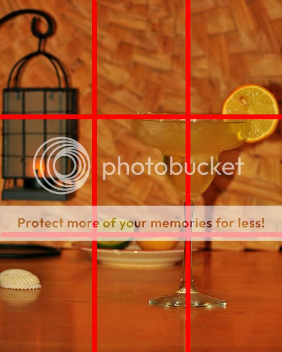
[FONT=&quot]Looks salty! :p[FONT=&quot] On composition I would say maybe leave out the shell on the left side not sure its contributing much to the scene. Also I would prefer to see more of the lamp in the background, as well as maybe pull the dish with the lime forward closer to the glass – I think it has more to do with the subject of the glass than with the background. On lighting, I would say maybe have a light shining a bit more on the background it is a bit dark in my opinion and it would take care of that shadow. Nice focus and I personally like the DoF you established, again just wish the dish were closer to the glass.

Nice job :)


[/FONT]
[/FONT] Disclaimer – C&C given without reading any previous comments in the thread, per the instructions of the group; redundant comments possible and probable.

 
I appreciate the thought that you put into including elements to support your tropical theme.

Composition of the elements seem too close to the edges (orange, lamp) and even cut off (shell, lamp stand).

There is a tangent with the citrus plate and the stem of the glass, I'd separate them or overlap even more.

The shadow of the glass is distracting, and I feel there should be more contrast in tone between the subject and background. I know that the woven background adds to the theme, but I can't help but think that a pale to mid blue (complimentary color) would really make your subject "pop".
 
Okay, just to forwarn you, this might be a little rough, but we're here to learn.... right?

This photo hit me like a cold fish. Three things hit me at once 1) White Balance 2) Tilted horizon and 3) Very Contrasty Lighting. So let's start there.

White Balance is much too warm. The lemons look orange. This I believe is due to the wood tones of the scene. I'm guessing you're around 6500K and you should probably be less than 5000K. This is an easy fix in post if you shoot RAW.

Tilted Horizon is an easy fix in post and should be looked at prior to uploading.

Lighting is way too harsh and washes away color and leaves the ugly shadows. If the light is coming from another room, you might consider lower wattage bulbs. :D Anyway, the lighting screams to be diffused. You can use any sort that is around the house... a bedsheet, a shower curtain, a tee shirt.... anything to diffuse.

Now for the rest. I think if you had created some distance of the objects to the background, bringing them forward, I wouldn't feel so claustrophobic.

The lone shell adds no context to the story and being cut off, renders it useless. The lamp isn't a bad element to add, but the base kinda kills it for me. A couple of remedies might be to place some element that would cover it up (like more shells) or suspend from a wire without the base.

As far as hitting 3 out of the 4 intersect points.... you hit 2. Okay, so you say that the lemon hit one. Yes, but it seems accidental. Had you moved them forward, in greater focus and turned the dish so we don't see the chip...... I wudda given you three. :D


NaturalDisasterP1.jpg


:hug::
 
The drink looks quite tempting to me, but here are 3 things I would nit pick on:

The shell and lantern are both just barely nipped off the edge, I would prefer either a more deliberate looking cut off, or space to the outside of them.

The color of the beverage blends in too much with the background IMO.

The lighting angle is too near the camera angle for my taste. ("Flat" I think is the term) The shadows are nearly behind the objects, especially those near the background.

Sorry if anything is a repeat, I didn't read the other c&c yet
 
Thanks for the C&C.....
I have to agree with everything said! At first look...i really liked it. Then the more i saw it the more i saw the imperfections and just the plain dullness and lack of orginatlity as well.
The color throws me off even more now looking at it. Ive defintely done some research and thought long and hard about everything i could have done differently. As well as paid close attention to what the other "students" posted for the assignment.
Believe it or not, a lot of thought and time did go into the shot...and i still like the idea behind it...But not long after i uploaded i wanted to delete and start again.
When i have more time, i plan to do another "drink" shot...And hopefully it will be much much much better!
Even with limited space and subjects...I know i could have done a lot better if i would have been thinking about it in a different way. I was more concerned with set up and trying to put as much in to match them theme than i was anything else.
 
At first look...i really liked it. Then the more i saw it the more I saw the imperfections...


I know exactly the feeling you are talking about. Many times here on TPF I have posted something I thought was really good only to look back later and have second thoughts.

I do think you are being a little harsh on yourself though. We are all here to learn and that means practice, figure out where and how to improve, and repeat indefinately. If you gave it an honest effort to visualise your shot and then make that vision into your photo you have already accomplished something many have never even tried.
 

Most reactions

Back
Top