bc_steve
Been spending a lot of time on here!
- Joined
- Feb 8, 2013
- Messages
- 1,384
- Reaction score
- 622
- Location
- British Columbia, Canada
- Website
- www.stevedinicol.com
- Can others edit my Photos
- Photos OK to edit
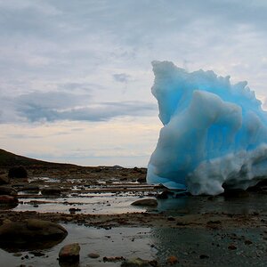
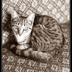
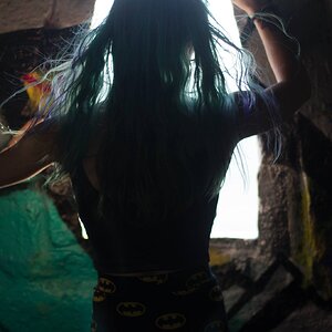
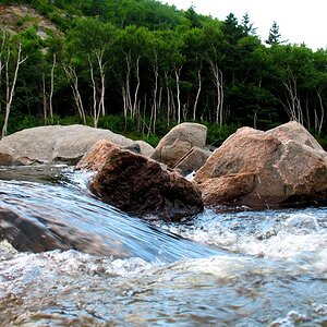
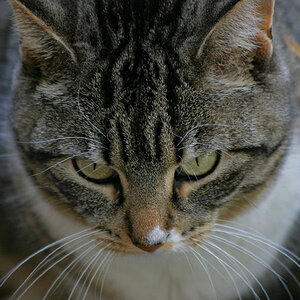
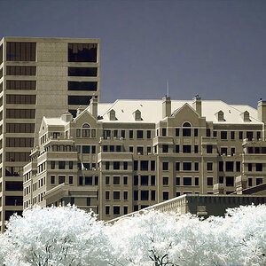
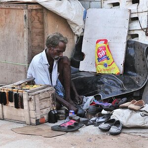
Steve Dinicol Photography - Quesnel, Kamloops, and Beyond
I made this a few weeks ago. Don't have a specific purpose for it yet, but I thought it would be handy to have a site that is my own that I can refer people to that showcases my favourites. My Flickr account is cluttered with every random thing I've thrown up there and it's nice not to be associated with another website.
I did it on wordpress. Just wanted to keep it simple, but I ended up having to learn more code writing than I had planned. There's a few compromises due to my lack of programming knowledge but it's mostly how I like it and I did it myself. Last made a website back in the late 90's. It was a lot more difficult/annoying back then!
Mostly would like to know if there's anything you find annoying about it, or if it takes too long to load.
I do think the header is a little large. I would like to make it a little more narrow but I haven't been able to create anything I've liked enough yet ....
")