Navigation
Install the app
How to install the app on iOS
Follow along with the video below to see how to install our site as a web app on your home screen.

Note: This feature currently requires accessing the site using the built-in Safari browser.
More options
You are using an out of date browser. It may not display this or other websites correctly.
You should upgrade or use an alternative browser.
You should upgrade or use an alternative browser.
Some more from a newbe
- Thread starter Kevin07
- Start date


- Joined
- Feb 1, 2004
- Messages
- 34,813
- Reaction score
- 822
- Location
- Lower Saxony, Germany
- Can others edit my Photos
- Photos NOT OK to edit
Hiya Kevin, welcome to ThePhotoForum  !
!
I went into your thread here and added numbers to your photos. Experience has shown that it is easier for the viewers to comment on photos in threads that show more than about 3 or 4 at the most when the pics carry numbers, you see?
!I went into your thread here and added numbers to your photos. Experience has shown that it is easier for the viewers to comment on photos in threads that show more than about 3 or 4 at the most when the pics carry numbers, you see?
- Joined
- Feb 1, 2004
- Messages
- 34,813
- Reaction score
- 822
- Location
- Lower Saxony, Germany
- Can others edit my Photos
- Photos NOT OK to edit
Something went wrong with my posting my comment at first, so I must double-post to now talk about your photos here.
As to Photo 1, the swan ... it is a very awkward crop here. Part of his beak got cropped off, and part of his tail, too. Seems like you just got too close. I would have wished for him to be all in the frame, and if not ALL then at least with entire beak.
With swans or anything so white you best underexpose (according to what your camera suggests it is UNDER-exposure!) a lot as not to "blow out" the white of the feathers (which means: make it too white and hence all featureless).
The top view of the timid blue-headed duck is nice, though compositionally quite centred. Play around with it a little and try out some cropping so that the duck, who looks over its right "shoulder" moves a bit to the right (by cropping off parts on the left) ... and then, to maintain normal print sizes, crop in the necessary amount from above. Try that and see if the photo gets more "impact", maybe?
Photo 3 is a bit "pale" ... I assume this is straight from the camera, no post procession done to it? Believe me, there is more in there, colourwise and contrastwise, than meets the eye just now. You can make it "pop" more.
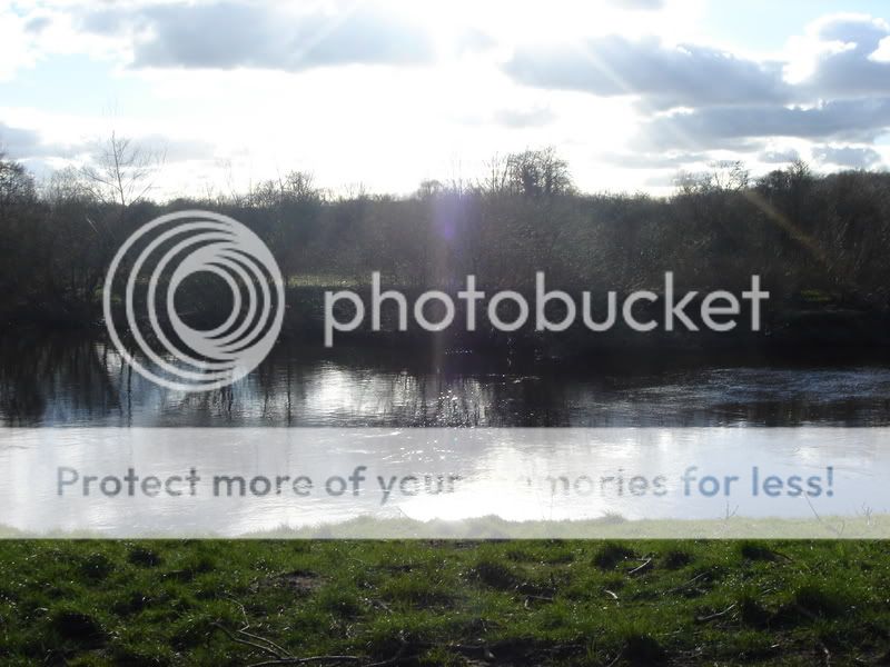
I really like composition of Photo 4. Nice converging lines given by the river banks, nice placement of the horizon line in the upper third, and a cool atmosphere, very wintery. It's a pity that both sky and its reflection are so non-descript ... if this were mine, I'd also play with it a little in something like Photoshop, not as much as to lose the atmosphere but so I'd get out a bit more detail, if that is possible.
Photo 5 looks overexposed.
The day was very hazy, too, which does not help matters too much. The inclusion of the bit of railing does not help things at all. One might try to play with it in something like Photoshop and see what can be tickled out of here but all in all I feel this is too overexposed. Detail of the water seems all gone...
That chicken in Photo 6 is an interesting variety but I don't feel your point of view does it any justice really, you might have wanted to kneel down and shoot through that fence/railing that we can see (in a distracting, tiny part) in your frame, too. Exposure on the feathers looks good, though.
The last one was tricky ... shooting into the sun always is, and although I see and appreciate what you were going for (to capture the rays that you could see), I find that centred ray/lens flare (?) too centred. And all in all also that photo looks overexposed.
Did you shoot with your camera set to AUTO?
As to Photo 1, the swan ... it is a very awkward crop here. Part of his beak got cropped off, and part of his tail, too. Seems like you just got too close. I would have wished for him to be all in the frame, and if not ALL then at least with entire beak.
With swans or anything so white you best underexpose (according to what your camera suggests it is UNDER-exposure!) a lot as not to "blow out" the white of the feathers (which means: make it too white and hence all featureless).
The top view of the timid blue-headed duck is nice, though compositionally quite centred. Play around with it a little and try out some cropping so that the duck, who looks over its right "shoulder" moves a bit to the right (by cropping off parts on the left) ... and then, to maintain normal print sizes, crop in the necessary amount from above. Try that and see if the photo gets more "impact", maybe?
Photo 3 is a bit "pale" ... I assume this is straight from the camera, no post procession done to it? Believe me, there is more in there, colourwise and contrastwise, than meets the eye just now. You can make it "pop" more.
I really like composition of Photo 4. Nice converging lines given by the river banks, nice placement of the horizon line in the upper third, and a cool atmosphere, very wintery. It's a pity that both sky and its reflection are so non-descript ... if this were mine, I'd also play with it a little in something like Photoshop, not as much as to lose the atmosphere but so I'd get out a bit more detail, if that is possible.
Photo 5 looks overexposed.
The day was very hazy, too, which does not help matters too much. The inclusion of the bit of railing does not help things at all. One might try to play with it in something like Photoshop and see what can be tickled out of here but all in all I feel this is too overexposed. Detail of the water seems all gone...
That chicken in Photo 6 is an interesting variety but I don't feel your point of view does it any justice really, you might have wanted to kneel down and shoot through that fence/railing that we can see (in a distracting, tiny part) in your frame, too. Exposure on the feathers looks good, though.
The last one was tricky ... shooting into the sun always is, and although I see and appreciate what you were going for (to capture the rays that you could see), I find that centred ray/lens flare (?) too centred. And all in all also that photo looks overexposed.
Did you shoot with your camera set to AUTO?
simonkit
TPF Noob!
- Joined
- Dec 30, 2006
- Messages
- 238
- Reaction score
- 21
- Location
- North Wales, UK
- Website
- www.landscapephotographyuk.com
- Can others edit my Photos
- Photos NOT OK to edit
Hi,
Just a few of my thoughts:
I think the Swan shot would have been better without the crop.
In the landscape shots the lighting is particularly harsh which makes it very difficult to capture that "knockout" image. Pretty much all of the best landscape photographs you see will have been taken around dawn/dusk or during subdued lighting conditions.
The last shot is virtually impossible to expose correctly, strong sunlight will mean that the dynamic range of light in the shot is beyond the capabilities of the camera, meaning you will have to choose to expose for either the sky or the foreground detail - the result is either dark foreground or "blown" sky detail as in your shot.
If you can revisit the landscape locations in better lighting & try the shots again to compare the results
look forward to seeing more of your posts
simon
mschris
TPF Noob!
- Joined
- Apr 4, 2007
- Messages
- 42
- Reaction score
- 0
- Location
- Hernando, MS
- Website
- www.midsouthphotos.com
- Can others edit my Photos
- Photos OK to edit
Kevin,
Mind if I mess with number 3? I have an idea to spice it up a bit.
Thanks,
Chris
Mind if I mess with number 3? I have an idea to spice it up a bit.
Thanks,
Chris
Kevin07
TPF Noob!
- Joined
- Apr 5, 2007
- Messages
- 10
- Reaction score
- 0
- Can others edit my Photos
- Photos OK to edit
Kevin,
Mind if I mess with number 3? I have an idea to spice it up a bit.
Thanks,
Chris
Carry on chris
Kevin07
TPF Noob!
- Joined
- Apr 5, 2007
- Messages
- 10
- Reaction score
- 0
- Can others edit my Photos
- Photos OK to edit
Something went wrong with my posting my comment at first, so I must double-post to now talk about your photos here.
As to Photo 1, the swan ... it is a very awkward crop here. Part of his beak got cropped off, and part of his tail, too. Seems like you just got too close. I would have wished for him to be all in the frame, and if not ALL then at least with entire beak.
With swans or anything so white you best underexpose (according to what your camera suggests it is UNDER-exposure!) a lot as not to "blow out" the white of the feathers (which means: make it too white and hence all featureless).
The top view of the timid blue-headed duck is nice, though compositionally quite centred. Play around with it a little and try out some cropping so that the duck, who looks over its right "shoulder" moves a bit to the right (by cropping off parts on the left) ... and then, to maintain normal print sizes, crop in the necessary amount from above. Try that and see if the photo gets more "impact", maybe?
Photo 3 is a bit "pale" ... I assume this is straight from the camera, no post procession done to it? Believe me, there is more in there, colourwise and contrastwise, than meets the eye just now. You can make it "pop" more.
I really like composition of Photo 4. Nice converging lines given by the river banks, nice placement of the horizon line in the upper third, and a cool atmosphere, very wintery. It's a pity that both sky and its reflection are so non-descript ... if this were mine, I'd also play with it a little in something like Photoshop, not as much as to lose the atmosphere but so I'd get out a bit more detail, if that is possible.
Photo 5 looks overexposed.
The day was very hazy, too, which does not help matters too much. The inclusion of the bit of railing does not help things at all. One might try to play with it in something like Photoshop and see what can be tickled out of here but all in all I feel this is too overexposed. Detail of the water seems all gone...
That chicken in Photo 6 is an interesting variety but I don't feel your point of view does it any justice really, you might have wanted to kneel down and shoot through that fence/railing that we can see (in a distracting, tiny part) in your frame, too. Exposure on the feathers looks good, though.
The last one was tricky ... shooting into the sun always is, and although I see and appreciate what you were going for (to capture the rays that you could see), I find that centred ray/lens flare (?) too centred. And all in all also that photo looks overexposed.
Did you shoot with your camera set to AUTO?
I always shoot on auto because i know no other way. Im new to this and thats why i have joined this forum to learn of its members.:thumbup:
- Joined
- Feb 1, 2004
- Messages
- 34,813
- Reaction score
- 822
- Location
- Lower Saxony, Germany
- Can others edit my Photos
- Photos NOT OK to edit
Well, I hope my thoughts on your individual photos here helped you a little already?
Along with your camera you should have got a CD with some programme on it for some post processing ... all the cameras come with at least a simple software for cropping photos, changing contrast and saturation, brightness and shadows... have you ever ventured into playing with that a little?
And - no matter how much you love to read manuals, which is something that I usually HATE, mind you - make yourself more familiar with your camera, leave the AUTO settings and test out the others. Play, test, discard, if necessary. This is digital photography, you can make a thousand errors and still not suffer from any additional loss (by paying for 36 blooper prints out of a film gone all wrong, for example).
I'll now go and check out your newest submissions.
Along with your camera you should have got a CD with some programme on it for some post processing ... all the cameras come with at least a simple software for cropping photos, changing contrast and saturation, brightness and shadows... have you ever ventured into playing with that a little?
And - no matter how much you love to read manuals, which is something that I usually HATE, mind you - make yourself more familiar with your camera, leave the AUTO settings and test out the others. Play, test, discard, if necessary. This is digital photography, you can make a thousand errors and still not suffer from any additional loss (by paying for 36 blooper prints out of a film gone all wrong, for example).
I'll now go and check out your newest submissions
.mschris
TPF Noob!
- Joined
- Apr 4, 2007
- Messages
- 42
- Reaction score
- 0
- Location
- Hernando, MS
- Website
- www.midsouthphotos.com
- Can others edit my Photos
- Photos OK to edit
Sorry for the delay. Been out since last Thursday am.
Anywho, here's a quick little something just to bring out some deeper greens, and add a little color to the water. Just to add a little pop.
You could even go further and make the sky blue, but to do that you'd have to add some more lighting. If anything, I probably made the greens too green, but I'm trying to make it a little less bland.
Hope this helps.
Most reactions
-
 412
412 -
 312
312 -
 281
281 -
 272
272 -
 264
264 -
 229
229 -
 196
196 -
 183
183 -
 165
165 -
 152
152 -
 142
142 -
 139
139 -
 135
135 -
 122
122 -
 103
103
![[No title]](/data/xfmg/thumbnail/36/36665-7c494bf98537fba5ac87ac5ad6bda658.jpg?1619737676)