some pictures

aleksey123

TPF Noob!
Joined
Sep 26, 2009
Messages
74
Reaction score
0
Location
USA/Russia
Can others edit my Photos
Photos OK to edit
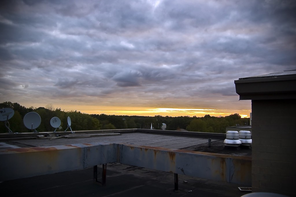
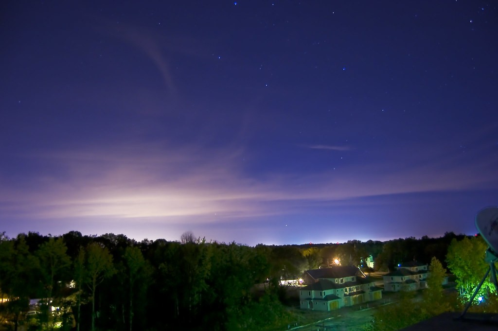
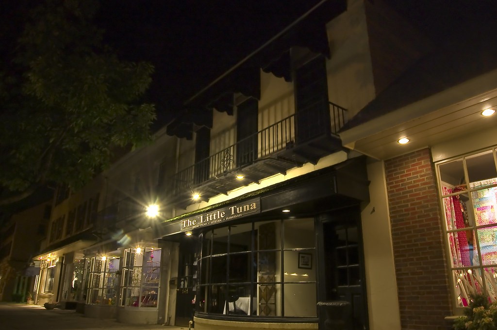
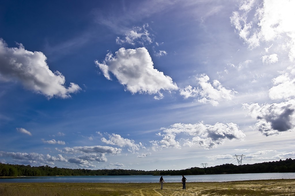
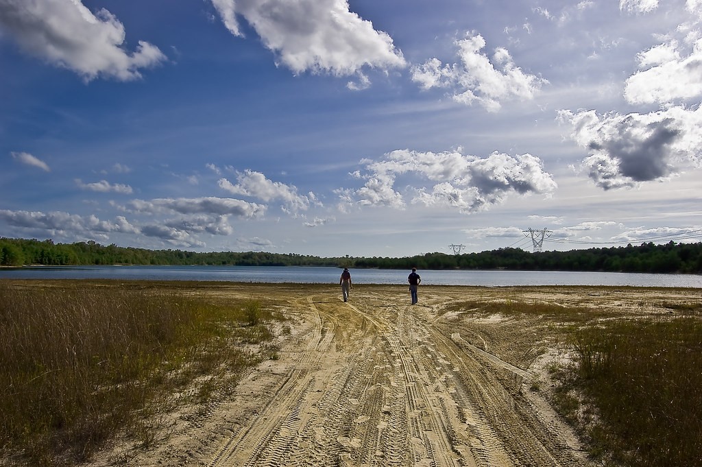
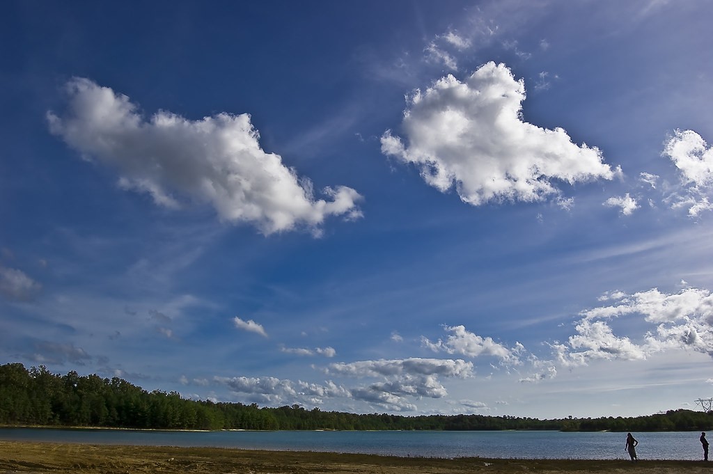
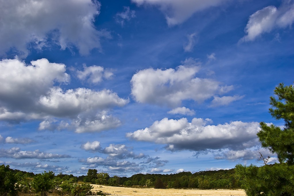
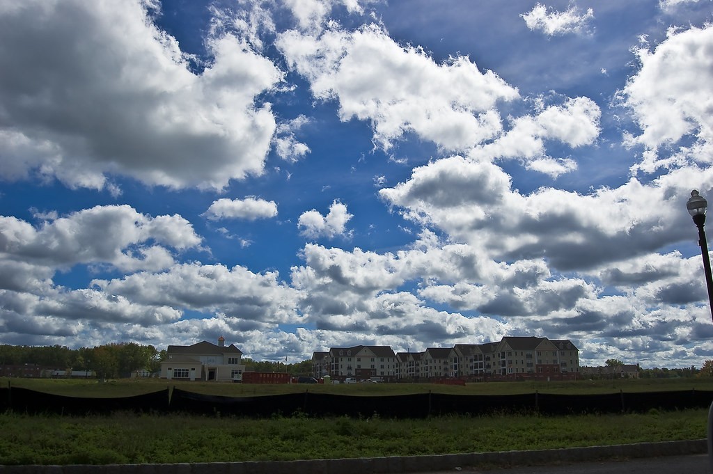
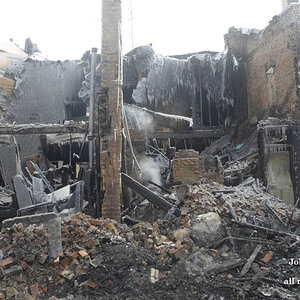
hello!!!! got my first dslr (nikon D40) i like it so far...here some pictures i took this week.....................
1
3955795646_e770d7bef5_b.jpg

2
3952989156_f7597d1bb9_b.jpg

3
3952213023_876ba1cd07_b.jpg

4
3954981713_b254ca10e5_b.jpg

5
3952186263_117f4c2abc_b.jpg

6
3952965052_38bab47764_b.jpg

7
3952198407_623c95964e_b.jpg

8
3952974836_87c69eeb47_b.jpg

9
3952188773_9f7e57e4af_b.jpg

10
3952189453_d63f03068e_b.jpg

11
3952194791_dfc4365f93_b.jpg

12
3952196461_ca1b1f827d_b.jpg

13
3952190315_06221667bf_b.jpg

14
3952191801_cf77dcac40_b.jpg

15
3955013017_84d4311e5a_b.jpg
 
Too many pictures to C&C..........cut your post down to 2 or 3 and people will comment more.

;)
 
I agree, way too many pictures. Doesn't seem to be any continuity to the series, except too much sand, water and sky.

I will comment on your first photo. Not sure what your emphsis is on this photo. Is it the sunrise/sunset, the rust on the building, the number of satellite dishes or the angle of the piece of building. Any one of these may have made an interesting photo, but too many elements make it confusing. I think when you take a photo, or a series of photos, you should be trying to tell us a story. Also after looking at it on a calibrated screen it seems a little underexposed.
 
In the future try to limit your photos to no more than 4 if you want C&C. There are far too many to comment on individually.

In the second shot, I like the sky, but the block of houses and the bright green bush and satellite dish on the right are a big distraction.

In #5 I would have stood more to the right and shot to the left which would have angled the pathway a bit and added more interest as well as keeping the high tension towers out of the image.

In #9, I like the vast openess that the shot creates, but I'd suggest cloning out the high tension tower on the horizon.
 
i don't think they're carefully composed or something, but I like the openness in most of the shots. the only closeup, #14, is not bad either, but the subject could definitely have done with a more contrasting/blurred background - one really has to stress one's eyes on that.
 
I like #1 because the perspective is a little different, I know I rarely get on top of a building... I think it would look good as a(not overdone) HDR image.
 
Although #2's PP is WAY overdone, it's quite interesting.
 
I could be wrong, but I'm not sure there is any post work done on that photo. I'd sure like to know if there is though... calling the OP.
 

Most reactions

New Topics

Back
Top