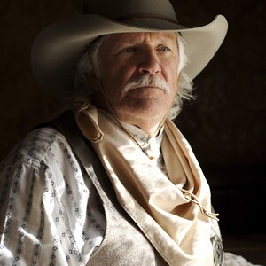
The first three portaits are nice; the wall looks well-made,with very even grout lines, well-formed bricks that were obviously made by a quality brick makeing factory, and the first three photos have nice,even lighting that shows the wall's solidity and conveys a feeling of rock-solid masonry work that will last for decades more. The girl in the background is nice too, although she's off-center a bit and competes for attention with the bricks.
Portrait six is nice too, but in that one the wall appears darker,and more moody, but on balance, the girl in the lower left hand side of the frame looking up and to the right focuses attention on the fine grout work the wall possess. Overall, if I were the stonemason who layed the bricks, I would proudly frame these portraits and display them.
The other shots, what numbers would those be? let's see-- four,five,seven and eight I would guess, are good too.
C&C per req. A good start, but I see three recurring areas of concern with your images:
1. Composition: Bust portraits should have all of the head, and perhaps a little bit of shoulder as well; cutting off the side of a person's head is not normally a good idea. Try and place the subject about 1/3 in from one side or the other. As well, there's a reason that they refer to the vertical orientation as "portrait".
2. Lighting: Natural lighting is fine, but often it's not enough on it's own. To really make these sort of images pop, you should carry a 5 in 1 reflector in order to bring some (not necessarily a lot, but some) illumination to the shadow side of the subject's face.
3. Excessive DoF and/or subject too close to the background. Use a larger aperture (smaller 'f' number) and/or put more distance between the subject and the background to render it more softly focused and less distracting.
Agree with TI. . .the lighting is flat in all of the shots. I mean nothing is overblown. . .but nothing is accentuated either. Theres no "direction" achieved with the lighting.
Same with the focus here. . .too much is in focus; which wouldn't necessarily be a problem if there was something more interesting than the wall. . .
I appreciate everyones responses, in this thread and in my others. I want to learn so i can progress and achieve the peek of my abilities. Like i said in a previous post, Its been a big learning curve for me in these few first weeks of trying to make the transition from snapshot to photograph. Everyone has been a big help and i will try to apply everyones suggestions into future photos.


![[No title]](/data/xfmg/thumbnail/31/31014-6b1a572624824b852f5adaf3594767af.jpg?1619734569)
![[No title]](/data/xfmg/thumbnail/36/36301-27972c0474532c2ef657014362950733.jpg?1619737495)

![[No title]](/data/xfmg/thumbnail/33/33421-38d09827e584b8381c5e3a468cdf0159.jpg?1619735961)