Mr. Murmeli
TPF Noob!
- Joined
- Jan 10, 2009
- Messages
- 92
- Reaction score
- 0
- Location
- Finland
- Can others edit my Photos
- Photos OK to edit
Hi,
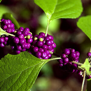
This first one I took several months ago and decided to photoshop it. I kinda like it but don't know if anyone else sees anything in it
1

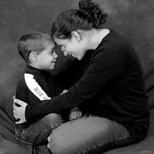
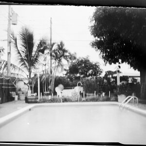
This was originally just a test shot with my bride and joy, Zeiss MF lens.
2

And this last one I took when i was fishing in Northern Sweden. This picture is actually my current wallpaper on my computer screen. (That's why the aspect ratio is 16:10)
3

Comments and critique are greatly appreciated!
This first one I took several months ago and decided to photoshop it. I kinda like it but don't know if anyone else sees anything in it
1
This was originally just a test shot with my bride and joy, Zeiss MF lens.
2
And this last one I took when i was fishing in Northern Sweden. This picture is actually my current wallpaper on my computer screen. (That's why the aspect ratio is 16:10
)3
Comments and critique are greatly appreciated!


![[No title]](/data/xfmg/thumbnail/37/37605-90c8efaef5b7d1f52d4bf8e7dfd33673.jpg?1619738148)
![[No title]](/data/xfmg/thumbnail/31/31977-2b717e032201241cbeae8226af23eba4.jpg?1619735136)
![[No title]](/data/xfmg/thumbnail/37/37609-a1984365804384f841d8245ae7e3b9a7.jpg?1619738149)

![[No title]](/data/xfmg/thumbnail/35/35879-b9a5a75c88f724f404f976b0c0e67dbd.jpg?1619737207)