schumionbike
TPF Noob!
- Joined
- Mar 9, 2007
- Messages
- 1,083
- Reaction score
- 0
- Location
- Houston, Texas
- Can others edit my Photos
- Photos OK to edit
I like 1 and 2 the best. I also like the original one better since there's a contrast and bring more attention to the light. I think 2 is very creative and I love that composition. Number 3, I know it's a good photograph, I just don't know what it is so to me, it didn't draw that much interest.

")
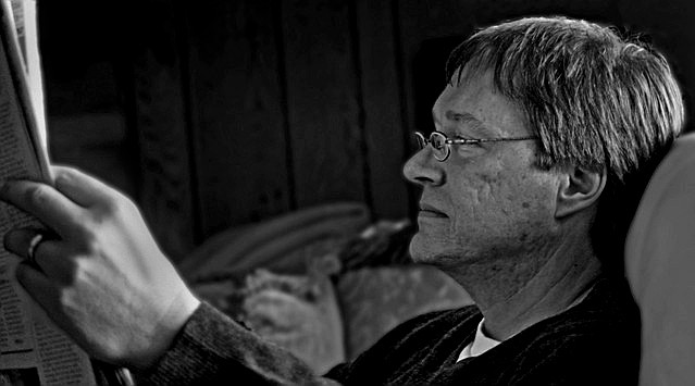
 Who do you think you are burning my dad?!