
- Joined
- Sep 2, 2003
- Messages
- 34,533
- Reaction score
- 7,560
- Location
- In the mental ward of this forum
- Can others edit my Photos
- Photos NOT OK to edit
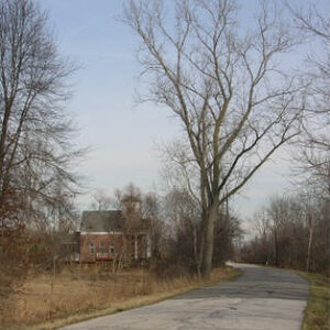
karissa said:Is that better Terri? I just updated the same pict to save server space.
Gee, you're good.... Chase should give you a cookie for being so considerate!

It IS better, there is definitely more detail in the tree. But comparing it to your color, there could be even more. It could still be a tad lighter, overall. Try lightening it a gross amount, until you definitely see all the grain in the wood, then start playing with your contrast.
This is where I get frustrated with digital images. I know it's possible to get nice-looking B&W's from color, and I think this image could be just dreamy if done by someone who is good at that. (I'm not!)
But I think it calls for a different approach than plain ol' brighten/contrast in PS. I think you want to take it where you can adjust the RGB filters before you start seeing the real depth and various tones in a good B&W, if that makes any sense. 


![[No title]](/data/xfmg/thumbnail/41/41905-b622c7d92c817afea0d4f5704e7fb329.jpg?1619739940)

![[No title]](/data/xfmg/thumbnail/42/42040-7a66cabbeffd44783ea44a91ef4d0e70.jpg?1619739987)