Space Ship Earth Now Arriving

smoke665

TPF Supporters
Staff member
Supporting Member
Joined
Mar 29, 2016
Messages
14,811
Reaction score
8,260
Can others edit my Photos
Photos NOT OK to edit
I tend to get hooked on things and they have to run their course before I can let them go. This one is a combination of the slow shutter/zoom technique I've been practicing and a composite. I needed some clarity on the focal point (hence the composite). Also, not sure if I like the color or the conversion, both have certain things I like. C&C welcome.

Epcot01242018_190-Edit.jpg by William Raber, on Flickr

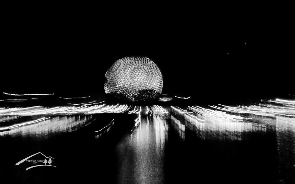
Epcot01242018_190-Edit-Edit.jpg by William Raber, on Flickr
 
I like the color one.
But the B&W has a somber/moody look to it, which can fit a different theme.
 
I like the color one.
But the B&W has a somber/moody look to it, which can fit a different theme.

Thank you. I was leaning toward the color until I did the final edit on the conversion, now it's a toss up.
 
I'm leaning towards the B&W more because I like B&W than any significance enhancement in the B&W. But, I would crop to symmetry.

To me the focal point seems stronger in the B&W. Symmetry how??? Horizontal?? Vertical?
 
I'm leaning towards the B&W more because I like B&W than any significance enhancement in the B&W. But, I would crop to symmetry.

To me the focal point seems stronger in the B&W. Symmetry how??? Horizontal?? Vertical?
The middle of the illuminated ball, (the focus of the image), is not centered horizontally.
 
The middle of the illuminated ball, (the focus of the image), is not centered horizontally.

Ahh, but is the sphere the focus??? There are multiple focal points in the image, the light streaks, the sphere's reflection, and of course the sphere itself. My reasoning for the crop, was the sphere is a powerful focal point, when you put it in the center, it draws the eye in and creates a static composition, taking away from the other elements. Pulling the sphere off center, and putting the sphere reflection at or close to the center, equals out their importance, creates a dynamic composition, and forces the eye to explore the other elements.

I thought you might have been referring to vertical alignment of the composition which I'm still unsettled on. I almost feel like there is to much negative space at the top.
 
Nothing wrong with static.

Yep, in some cases it can be quite soothing, though that was not the intent in the composition.
 

Most reactions

Back
Top