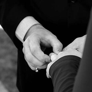
...and also a sprinklerless, pictureless version...
I suck at Photoshop, plus these are quick and dirty edits.
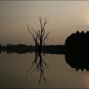
Not sure how I feel about these compositions. On one side they look cleaner (and more abstract in the case of the last one); at the same time I feel they are missing something...
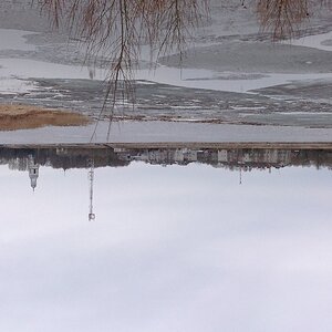
Very nice indeed - lovely composition and exposure. An alternative might be to have something on the stairs to break up the symmetry - a child, teddy bear, or something unusual. How about a slinky?
I completely agree; I like symmetries, but I LOVE almost-symmetries. I prefer not to stage my photos, though... and there wasn't anything there to break the symmetry this time
I like version 2. I feel that the sprinkler acts only as a speed bump as you eye goes down the runway to the room. However, I agree that the picture, or something else dark is needed in the room. The rectangular picture works well, but I do not like the amount of portrait that is visible, not in a sense of overall composition, but the composition of just the portrait.
I completely agree; I like symmetries, but I LOVE almost-symmetries. I prefer not to stage my photos, though... and there wasn't anything there to break the symmetry this time
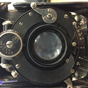
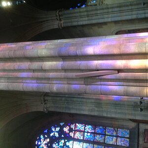
It was a pale green. Good eye!
I think I prefer the original too. The building is the Pioneer Courthouse in Portland, Oregon, by the way.
I like version 2. I feel that the sprinkler acts only as a speed bump as you eye goes down the runway to the room. However, I agree that the picture, or something else dark is needed in the room.
The rectangular picture works well, but I do not like the amount of portrait that is visible, not in a sense of overall composition, but the composition of just the portrait.
Agreed too. However, to make more of the painting visible, the shot would've had to be taken at a higher angle, which in turn would've changed the concept altogether. It was a trade-off, and the painting lost

")
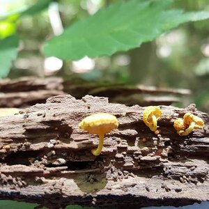
![[No title]](/data/xfmg/thumbnail/32/32698-38e2346942223e17b43fb958f66064c1.jpg?1619735601)
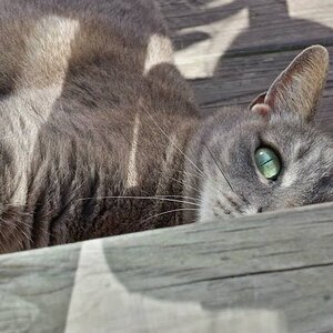
![[No title]](/data/xfmg/thumbnail/37/37604-7ad625e983f92f880eb65a264eeef5e4.jpg?1619738148)