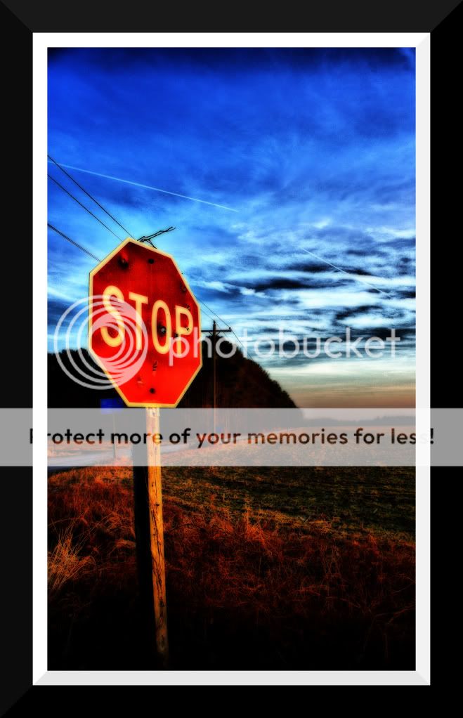
However, in #1 you are pushing it too far and degrading the image quality.
I would love to see that stop sign in crisp focus, to really make it pop, and maintain the color you brought up. I am not fond of the wires at the top of the stop sign though. Not the telephone wires, just that curly bit.
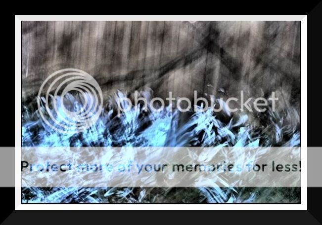
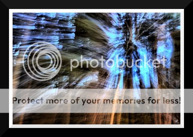
The second two, show that you (hopefully) really gave some thought to the subject you were capturing with the long exposure motion blur, compared to the last series you posted. Good job.
However, in #1 you are pushing it too far and degrading the image quality.
I would love to see that stop sign in crisp focus, to really make it pop, and maintain the color you brought up. I am not fond of the wires at the top of the stop sign though. Not the telephone wires, just that curly bit.
The second two, show that you (hopefully) really gave some thought to the subject you were capturing with the long exposure motion blur, compared to the last series you posted. Good job.
This is proof that Bitter and others do care and do try and help people that want to learn.
I agree with #1, a bit overdone, but it could be a good shot, specially if you got rid of the powerlines.
I kind of like what is going on in #2, has a spooky feeling to it, not too sure about #3, cant quite tell what it is.
#2 is totally like a dream like fog of fear and panic. The "No Outlet" is just subtle enough....
#3 is a great abstract. It has action, or motion, and the lines lead your eyes around all over the place. It feels (too me) nervous and twitchy, yet somehow there is enough comfort to keep me there.
I kind of like no. 1 myself. I also wouild like to do away with the power lines, but think the "overcooked" look on this ones suits it well. I suppose it would depend on the intended use of the photo. Well anyway, I like it, maybe my eyess just need something bold at the moment.
I've never tried to do anything like number 2. Is there any tricks you could share, or is it simply slow shutter and experiment?
I do not like the extreme PP, maybe tone it down some, not a lot but some.
I think the stop sign is your focus, I would try to remove the wire Bitter mentioned, and maybe see what it looks like without the power wires. I would also remove the blue sign just to the left and behind the stop sign. Let the stop sign be the 'star'.
I really like the sun and perspective in this shot.
After looking at #1 a bit closer, I do agree that it is an awesome shot, minus the power lines, and the 2 blue signs... I think I would also try to clone out that white line that seems to go through the sky.
After looking at #1 a bit closer, I do agree that it is an awesome shot, minus the power lines, and the 2 blue signs... I think I would also try to clone out that white line that seems to go through the sky.
I kind of like no. 1 myself. I also wouild like to do away with the power lines, but think the "overcooked" look on this ones suits it well. I suppose it would depend on the intended use of the photo. Well anyway, I like it, maybe my eyess just need something bold at the moment.
I've never tried to do anything like number 2. Is there any tricks you could share, or is it simply slow shutter and experiment?


") and I am 16
and I am 16

![[No title]](/data/xfmg/thumbnail/38/38262-10a9668da9a2b36a92cddde57caf87bc.jpg?1619738547)
![[No title]](/data/xfmg/thumbnail/38/38265-4b75e7e05f8bf906800580ac7f7ddf60.jpg?1619738549)
![[No title]](/data/xfmg/thumbnail/38/38261-db20f6f92ee8f0d4c5cf1536e308638b.jpg?1619738546)


![[No title]](/data/xfmg/thumbnail/38/38263-ad5e4c9e677626ddb5b1e7cdf9ebe40e.jpg?1619738548)