Streets of London

kirif1

TPF Noob!
Joined
Mar 18, 2009
Messages
88
Reaction score
0
Location
London
Website
www.flickr.com
Can others edit my Photos
Photos OK to edit
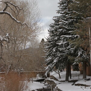
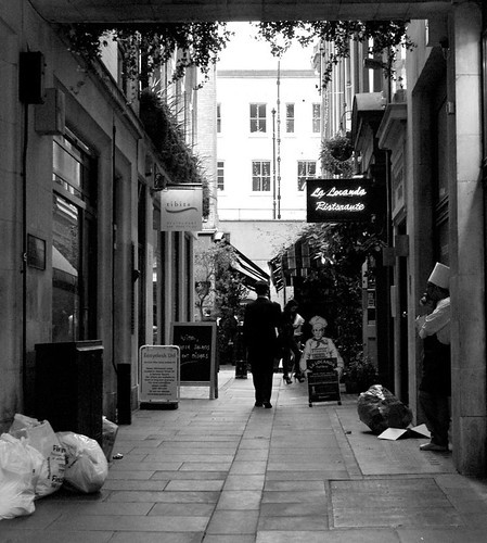
I Went for a walk around central London yesterday, it was horrible and overcast with an awful white sky so I battled with my settings. Here are a few...

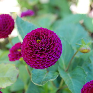
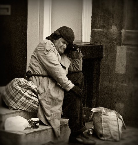
#1 It's harsh out there!
3533008083_035281ca90.jpg


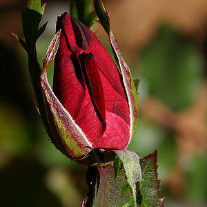
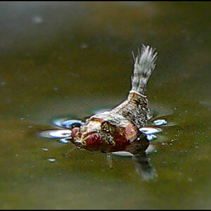
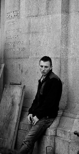
#2 Unfortunately had to crop this one alot
3533822868_a384cb86c2.jpg


#3
3533007033_9865c5c534.jpg


#4
3533005593_63803967fd.jpg


#5
3532972299_7920519c11.jpg
 
i kinda like number 2 best. Personally i would have cropped all that space above his head off. I think his expression is the most interesting aspect of the photo.
 
any comments? anyone? crit??

work on composition a little bit
various amounts of dead space and legs cut off, etc.

the fake edge blur doesnt do much for me on the first one either.
 
any comments? anyone? crit??
As you've discovered, posting more than 1 image in a post inhibits responses. It take a bit of time to examine and then comment on one image let alone times 5. If you want critique I highly recommed 1 image per post and specifically ask for critique.

I wonder what technique/software you use for converting to b&w if it's not done in-camera?

One of the main goals in b&w photography is controlling the contrast. It's a way to add dimensionality and interest to a colorless image. Dodging and burning are also extensively used to highlight and sequester portions of an image to guide athe viewers eye through an image.

For myself b&w images are much more time consuming to make than color images.

#1. Decent composition. I'm not a fan of sepia toning but that's me. In this instance I think it does add to the image in a dream llike way. I wish there was a bit more image under his foot. The gaussian blur vignette highlights the "how did I come to this" dream like quality of the man's situation.

#2 It looks a tad underexposed. His posture and expression are what make the image. Virtually everthing else is unnecessary. Were it me I would crop even more on top,leaving only the last line of text on the wall and bottom, ridding the image of the blob in the lower left corner. It appears his feet weren't visible in the shot anyway. I would not alter the contrast.

#3 Tough exposure with the bright wall in the far background. Fill flash would have helped balance that. Off camera flash would have made for interesting shadow effects. Compositionally the slightly converging lines and slight diagonal make it interesting.

#4 Compositionally your subject is too centered. his gaze would make more sense if the space in front of him was a bit wider. With 1/2 the background and 1/2 dark I'd say you picked the wrong shooting location. Perhaps he would have moved in a way for you to get a better shot, maybe not. I consider this the weakest image of the 5.

#5 I like the composition but would straighten the lamp post and crop some off the right side. I also like the grain/noise and minimalist look of the image. For me this is the strongest image of the 5 with #2 a close second. :thumbup:

I hope that helps. Keep shooting, strive to get the whole person in the frame and watch your backgrounds. You've got an enviable shooting environment.
 
Thanks for all your comments and advice, its much appreciated! I'm using photoshop to convert the images into black and white. I do see that i need to work on my composition and framing my subjects better. I battle with getting a good contrast on my images and so need to learn more about that and try again! :)
 

Most reactions

Back
Top