ztriola
TPF Noob!
- Joined
- Jun 19, 2009
- Messages
- 24
- Reaction score
- 0
- Can others edit my Photos
- Photos OK to edit

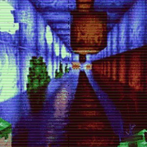
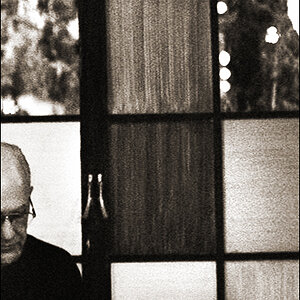
it doesnt look that blue on my computer but once it was on flickr it turned like that. i dont know. there was an umbrella to the his right and a reflector to his left. i used a lightsphere behind his head so it would spread the light enough for a rimlight and br light.
comments?
![[No title]](/data/xfmg/thumbnail/32/32164-d68fa2de02f9bef524bbd68aac2f12e4.jpg?1619735234)

![[No title]](/data/xfmg/thumbnail/30/30887-70db98f68651b2f6c62119e611f707c0.jpg?1619734499)