Success or Catastrophic Failure

:thumbup: Now were talkin'! Nice job Bitter! :thumbup:

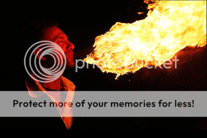
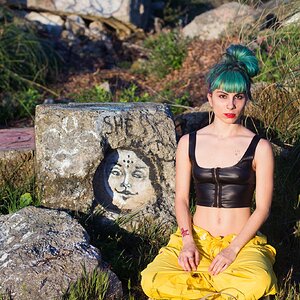
I really like the exposure on the subjects face.
 
Awesome edit Bitter!! I was stunned by the original image but wanted to see a bit of a brighter face. To the OP: this seems like a hard shot to capture. I'm impressed because I can't even wrap my head around what to expose for or how to expose properly. May I ask your technique and settings? Was this a friend or street performer?
 
Thanks for all of the feedback.

The fire-eater is a friend of a friend of the family who happens to be a street performer during the summer months in Quebec city.

As to the way this was shot, the camera was set to Program with the exposure lock set from the first fireball he blew.(I'm not experienced enough yet to be able to meter something like this so I more or less let the camera do it for me) I used a 75-300 mm lens at roughly half zoom. (Judging by the strength of Bitter's edit I probably should have gone tighter but I was really trying to catch the whole fireball in each shot.) The rest is all a matter of patience and trying to guess when the fireball is at it's biggest. (You're seeing the one good shot of the session.)
 
I might even crop it a little tighter, too.

If it's not too much trouble, could you show me how much?
Thanks.

One step ahead of you...err...I was working on it. :lol:

To me, trying to include "all" of the fire misses the point. People tend to be subjects we look at. Just because the fire is cool, doesn't mean it needs to dominate the image, making the guy secondary.

This is what I see:

fire.jpg


If you noticed, I also extended the canvas, to add some more space under the "V" his shirt creates. I think it helps keep the viewer in the frame, and not so close to the bottom edge.

:thumbup: it was a really cool shot to begin with, however this editing process made your picture ten times better!
 
Just out of curiosity, how did you decide where to crop the the image Bitter? Is it just a matter of what looked good, or was there some reason you cropped it there?
 
Ancient chinese secret.


I was just looking for visual balance. Balance of the subject (guy), secondary subject (fire) and the empty space. I added space to the bottom of the image to bring the subject up into the frame, rather than let him ride the edge, which I guess could be described as cause tension at the edge, rather than keeping your eye up in the image.

As far as trying to get the whole fireball, that creates a different image, with a different intent. The fireball becomes the subject and should dominate. The guy becomes secondary, and helps tell the story and provide scale. For this image, I would have included all the guy, rather than cropping him in half.

It's all my take on your subject, and what my mind tells me looks good. There is no real right and wrongm but at the same time some things work, and some things don't.:p You have to make choices based on each image.
 
That is a nice shot, lots of impact, but I think it is more of a candid. If you like working with people and are good at putting them at ease then learning to pose and light are areas you want to concentrate on. I'm sure you can take classes or learn from some of the members of this forum. Feel free to check my studio site at Mercer Photography-Senior Home to see samples of portraits I have taken over the years.


I disagree. Cropping the flame makes it seem endless. If the whole thing were in the shot, it would minimize it, unless it visually dwarfs the figure.
 
A little late but I saw this picture and felt like it had quite a bit of potential. I ran it through some of my "Debuggers" to figure out why I can't increase the brightness at least a bit more. To my dismay the blue channel and green channels were far beyond any conventional means of repair. Fooled around a bit, after some horrid unsharp masking and surface blurring (sorry :x, its quite the bad job! In a bit of a rush off to sleep :p) this is what I saw from the original.
manfireohno.jpg
 

Most reactions

New Topics

Back
Top