Sunset Panorama from Mt. Hough

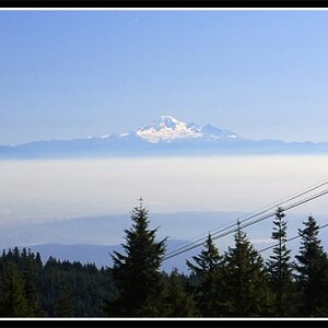
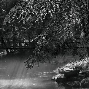
Not sure, but maybe some gentle adjustment brush strokes with negative clarity and burning on the foreground elements (grass, trees and rock).
 
Do you happen to have an unedited iteration that myself and others could try to edit? There really is some serious potential here, but I agree that it may be a touch overdone.


Sent from my iPhone using Tapatalk
 
That is outstanding, I like it alot. How many so called art works of a cubes or a spot gets raves.
It is beautiful and surreal. Keep it as is.

ken
 
Do you happen to have an unedited iteration that myself and others could try to edit? There really is some serious potential here, but I agree that it may be a touch overdone.
I don't want to offer up an unedited RAW or TIFF file this time. I prefer to re-edit myself, based on some of the advice given here. This way I don't feel like I'm trying to copy your vision, but stay true to my own and attempt to learn how to temper and refine it.

To make it easier for all to compare, I am posting both versions below. The top is the edited version, below that is the same photo from my original post. I lowered the saturation throughout. I removed the clarity, +exposure and shadow enhancement from the rocks and left only the warm color temp. The grassy area I removed the +exposure and shadow enhancement overall, but left a couple of +exposure streaks that I reduced slightly. That area already had some serious -clarity to soften, which I left as-is. I removed the shadow enhancement and +exposure from the tree line and added a little highlight only to the taller trees closest to the camera. In the sky and clouds, I reduced the shadows, clarity and slightly lightened the graduated filter from its original setting. I also spot healed the few white cloud specks that, although natural, seemed out of place and too sparse.

mt-hough1507pan3-01a-1920x.jpg


mt-hough1507pan3-01-1920x.jpg


Much improved, but I might even lower the brightness on that rock and the tree's a bit more. The shadow bits on both of those still seem too bright.

Jake
 
I couldn't possibly disagree more. I think you've taken an image that would make most anyone stop and linger if it were hanging in a galley and made it into just a pretty snapshot of another sunset.

I mentioned this in another thread, about editing your photos to someone else's tastes. That's not how it's supposed to work. You take the picture, you do the post work. It's in your head, you're the one that was there. No one else. If people like it, great. If not, thanks for stopping by.

Go back through this thread and look at the number of very positive responses to your original edit. Then look at the number that think it needs 'editing'.

No, Jim.....you are the one that is right here. You're original edit is absolutely a wall hanger. Subsequent edits......yawn.
 
Do you happen to have an unedited iteration that myself and others could try to edit? There really is some serious potential here, but I agree that it may be a touch overdone.
I prefer to re-edit myself, based on some of the advice given here. This way I don't feel like I'm trying to copy your vision, but stay true to my own and attempt to learn how to temper and refine it.

Very nice that you are willing to take SOME of the advice. Your statement here says much about your approach to your work after encouraging and accepting C&C.

Kudos!
 
My primary goal when posting photos in these Photo Galleries forums, as I believe most people's is, is for selfish reasons - I want people to like my pictures. But I also recognize that my vision is untamed. It can be a little too wild even for me. I like making dynamic images, but I prefer them to be based in reality.

There are many accomplished artists here. Some are extremely talented with software. Although there are those who are very good at both, a few are much better at one than the other. I don't consider myself an expert at content and composition, but believe I have a very good eye. Where I am least skilled at is manipulating the software to best reflect the drama and emotion of my vision.

Panoramas are particularly difficult in that they distort reality. A good illustration of that for me is this photo taken a few minutes before the photo leading this discussion.

mt-hough1507pan2-01-1920x.jpg


The sweep of the view is approximately 240°, whereas the OP photo's view is only about 170° (very close to normal human peripheral vision). In the photograph above, the shadows are incongruent with reality - you can't have the sun on the left side of the frame pointing directly at you and shadows falling away from you on the right side of the frame. In the OP photo, I realize I developed the picture in a way that put light from the sun where there should be shadow. Specifically, the rock. The side of the rock facing the camera was in shadow, not light. It was a mistake on my part to create the illusion there was light and a lot of detail.

Conversely, there actually was light falling on the grassy area. But in the perspective of the photograph, there shouldn't have been. The aspect ratio of the image was created to convey the peripheral vision of the viewer. I wanted to make the composition realistic, if not the color and drama of the view. So, the advice I chose to take was to turn the picture into something more realistic. However, I do not consider that last image perfect. I'm sorry my last edit turned the photo into a yawner for a couple of you, but it's the price I am willing to pay to develop my artistic talent.

I don't have the same attitude about the opinions of others that you do, @Bryston3bsst. Hoping others will like my pictures isn't the only reason I post. I come here to learn. There's a lot of C&C that goes on around here that isn't offered in an educational vein, but then that's not a requirement. There's also a lot of photography posted that offers no insight into the photographer's vision or intent and doesn't even describe how or with what the image was captured. Every day I see pics posted that have no other content except a link from the picture to the member's Flickr page. That's too selfish to me and I hope I never get to that point.

Then again, there might be some who think I babble on enough to make up for dozens of photo posts empty of words to go with them. ;)

Jim
 

Most reactions

New Topics

Back
Top