taking it in

JonMikal

TPF Noob!
Joined
Jul 28, 2004
Messages
12,262
Reaction score
327
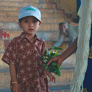
to me, this image breaks all the rules, especially composition as i feel i should have included more of the sitter and door frame, but at times i like the 'cutoff' look. the negative space at the top and bottom, at times, seem too much as well. i wasn't really trying to say anything with this that i know off; telling a story through an image is a new concept for which im still learning. mostly, i'm drawn to what my eye sees with no thought of conveying messages/stories. i'm working on that. i did a little crop and b&w treatment (which i'm not happy with either....the light sucked and i didn't have a pod). anyway, before i let this go i wanted to get your thoughts. thanks for any help you can lend.

OTE

25318250-L-1.jpg
 
Not keen on the distortion created by the lens, having a preference for horizontal lines to be horizontal, rather than curved, and would have cropped the top about level with the door frame
 
Just had a little play with it, and I think that you have a couple of crops in there that would work - if you sorted out the lines etc.

One is to crop along the back of the sofa and around the square panel on the wall so you have the figure at the bottom of the shot with the painting and surround out in front (does that make sense?)

and the other is to crop put the door and the bit of panel to the left leaving the sofa and the two paintings in the frame.

It looks a bit unfinished as it is - alternative is to go back and get the doorway in as well and use less of a wide angle to keep it straight
 
it is the strangest picture I have ever seen... I don't know what to say. On one hand it is extremely interesting Because the door is cropped out I don't know what's there and I'm wondering what might be there. But on the other the distortion is distracting. The lines are not straight what annoys me a bit.
 
yeah, i know about the distortion....wide angle lens. i guess i could reshoot this but the angle and lens will still create the distorted look unless a crop is in order. actually i think the comp is wrong.
 
well i tried to get the distortion out with PS but doesn't work for me. here's a b&w with some cropping at the top and bottom:

25318249-L.jpg
 
Hertz van Rental said:
If you'd like to list all the rules, Jon, I'll tell you if you've broken any :lol:

how 'bout instead of listing all the rules i'll just state 'i shouldn't have posted this poor excuse of an image' :lmao: come on, your turn to post a POS!
 
Here's my attempt at fixing the distortion. I've never done this before so don't be too judgemental hahaha:

DistortionFix.jpg
 
well that certainly looks much better! i assume you did that in PS with the distortion option?
 
haha thanks.

I just took it into Liquify, made the pinching tool as large as possible and clicked lightly once. There were a few horizontal lines that were off, but I just adjusted them with the move tool set what whatever size would best cover the area being adjusted.
 
Nicely seen JonMikal. I think the best version would be your cropped version (but in color) with some slight perspective adjustment done to eliminate the mentioned distraction - though in this day and age of ultra-wide lenses, we should be able to recognize it for what it is. However, here the distortion appears to be in a no-man's land of being slightly distracting...

By the way, was this shot from the hip? Everytime I try it, the guards will shoo me away (I'm assuming this is at the National Gallery?). My last attempts were at the Kertesz exhibit where a guard came running across the room and I nearly got a great shot of him waving frantically...when another guard tackled me from behind - they quickly trussed me up and dragged me out.

Tuna
 
Tuna said:
Nicely seen JonMikal. I think the best version would be your cropped version (but in color) with some slight perspective adjustment done to eliminate the mentioned distraction - though in this day and age of ultra-wide lenses, we should be able to recognize it for what it is. However, here the distortion appears to be in a no-man's land of being slightly distracting...

By the way, was this shot from the hip? Everytime I try it, the guards will shoo me away (I'm assuming this is at the National Gallery?). My last attempts were at the Kertesz exhibit where a guard came running across the room and I nearly got a great shot of him waving frantically...when another guard tackled me from behind - they quickly trussed me up and dragged me out.

Tuna

thanks for responding Tuna.

yes the NG, where tripods are prohibited these days, btw. the guards were no trouble but setup was difficult. getting anything inside the gallery areas almost always requires a wide angle and with the ceiling heights, avoiding distortion is almost impossible. unless you've been commissioned by the gallery to shoot you're screwed. actually, i posted this in the photo gallery and mentioned you in the intro with a question.....:lol: like you wouldn't have recognized. http://www.thephotoforum.com/forum/showthread.php?t=24277

anyway, thanks again!
 
I actually really like this photo(the original), even with the distortion. The doorway is a tiny bit of a distraction(makes me wonder whats on the other side) but the way you captured the subject sitting on the couch, but not centered is really..i dont even know the word! its definately a different picture, but i REALLY like it
 
I'd really like this if the whole open doorway was in the shot! It kinda tells me the woman has a choice of sitting there and taking the paintings in or getting up and leaving through the door. The more I looked at it the more I wanted to see what was there to make the woman stay!

As in a UK quiz show over here! "Say what you see!"
 

Most reactions

New Topics

Back
Top