Taste funny to you too? photoshop cc

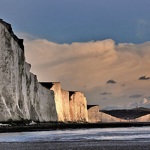
Actually I'd say take your second edited version (that is attempt 2 - the 3rd image in your first post) of your shot - run an auto levels and then the highpass filter that I told you about before over it and its far better still (it loses the harshness in the white areas that your original was hinting at and which contrast boosting I did exaggerated). Also gives the reds a desaturation (saturation layer and then select the red colour channel and desaturate them only) just to lose that reddy tinge

I'd be interested to know what you did for the second edited version.
 
I went about the editing in a little different manner, but it ended up coming out about the same as Overread. Did all my adjustments in Lightroom. First edit is less vibrance, the second is a little more.

Here is your original:

IMG_1293.jpg


20100419-IMG_1293.jpg


20100419-IMG_1293-1.jpg
 
I don't see too much overexposure, but if you are consistantly overexposing you may want to shoot in RAW, you can then go back and correct it. I can't cast stones, I don't use it that much. Mainly because I shoot my kids sports alot and I like my burst without the limitations of RAW. (But I know I should be shooting RAW because I rarely reach the buffer limit before I quit shooting)
 
I liked the shot so I tried a go at it (hope you dont mind).
Heres what I came up with:
Tiger.jpg
 
I'd be interested to know what you did for the second edited version.


ok... oh my 2nd attempt i started again with the original, and just darkened the highlights, I took the midtone contrast up a bit and took the overall contrast up just a tad also.. i have no idea how much of what i did, to be honest i just try'ed to make it look "darker" with out as much contrast as the first attempt.

Chriss i REALLY like your edit, and i dont mind anyone editing anything of mine, if your bored go for it :D

and to Ryan L ... maybe i am not overexposing as much as i thought... i guess the problem maybe more to do with me liking darker more under exposed shots and shooting my "target" *tigers* against a similar colored background and the colors are blending together


also im starting to think that my laptop's screen is messing with the colors of the photo's, i had some of my non-edited photos developed at walmart and the colors looked a lot better on print and on my cameras screen, compared to the laptop
 
also im starting to think that my laptop's screen is messing with the colors of the photo's, i had some of my non-edited photos developed at walmart and the colors looked a lot better on print and on my cameras screen, compared to the laptop

You have just opened a big can of worms called colour calibration!!

Essentialy computer screens are not calibrated to show true colours, this is mostly not needed for the majority of people and so the manufacturers simply don't bother with going for real world colour calibration. This means that when you are one of the groups who does need this (eg photographers) you have to take steps to ensure that you are using a calibrated screen.

For this there are some online free calibration charts, but these do not work because they rely upon the calibration choices being made by yourself. The problem here is that our eyes are adaptive and subjective so what you see as red I might see as a slightly different shade of red -clearly for photography prints this is not idea. Thus you need a hardware based calibration machine - eg a Spyder 3 - which you attach to the screen and then use it to calibrate your monitor to show true colours - where the machine is not subjective nor adaptive - red is red. This process also needs to be performed every so often because most screens will drift with colours over time.

However there is another problem to add to the mix which is LCD screens - flatscreens are poor for calibration because most do not hold constant contrast based on viewing angle - view your screen from higher or lower and the contrast will change quite noticably - something that the old CRT screens did not suffer from. There are LCD screens which don't suffer from this problem but as they are not a prime requirement by the market masses they cost a lot more than regular LCD screens (and if you happen to like DVDs or computer games and need a fast refreshrate as well the price goes up even more still).

However even if your screen is not perfect a calibration machine and workflow can help you a lot with at least getting a lot closer to what you get on print - it is at least a start in the right direction.

Also printers need calibration as well - something to consider if you are going to print from home, however I would say stick to printing through printing labs as home printing for good quality is very expensive to setup (the printer alone will cost a lot and that is without ink costs on top of that). Of course different printing labs will be calibrated to different scales so you need to calibrate your computer output to the printing labs requirements. The top labs report these printer profiles and offer them for download to allow people to calibrate to them (I have no idea how that works in practice, just the theory).
One trick I use is to order a series of postcard sized prints to check how they compare - often I have found that with a print (in comparison to a computer screen viewing) you have far whiter whites and blacker blacks on a print that you get on a screen - so often you need to boost the darker areas and tone down the brighter on a screen in order to get a good looking print. This might mean you end up ordering several postcard prints (not expensive which is why you do them that size) to get a perfect calibration. You can then work from that shot toget the rest looking correct for the printers.

Clearly a better viewing screen makes this process a lot lot easier as to does going more in depth with the calibration process.
 

Most reactions

New Topics

Back
Top