Trever1t
Been spending a lot of time on here!
- Joined
- Dec 30, 2010
- Messages
- 9,331
- Reaction score
- 2,722
- Location
- San Jose, CA
- Website
- wsgphotography.com
- Can others edit my Photos
- Photos NOT OK to edit
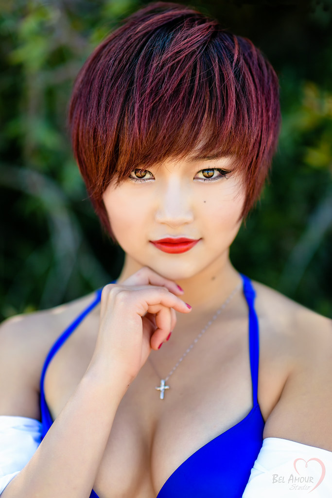
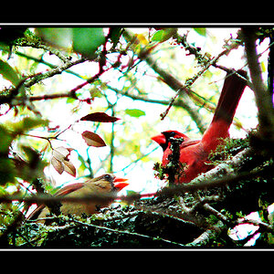
_POR3165-Edit by Bill Grayson, on Flickr
Shot at f1.8/85mm, I should've perhaps closed down a bit more?
")
 Nice.
Nice.
![[No title]](/data/xfmg/thumbnail/35/35965-cac1057a7f2dd8e8aeeefed50ae8c080.jpg?1619737282)
![[No title]](/data/xfmg/thumbnail/35/35963-4809c92024a0e6355dd194caf9297701.jpg?1619737279)

![[No title]](/data/xfmg/thumbnail/37/37606-3c9ffb5906173fa2aa489341967e1468.jpg?1619738148)