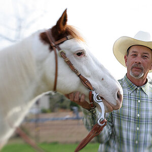
The Church and Steeple

Church Rat

TPF Noob!
Joined
Jun 7, 2007
Messages
18
Reaction score
0
Location
Los Angeles, CA
Can others edit my Photos
Photos OK to edit
Experimenting with Photoshop. What do you all think? The tools that I used were, Clone Stamp, Patch Tool, Healing Brush, Magnetic Lasso. I also changed the contrast in the 3 photos below to achieve a "dark" look. Maybe it's too dark?

I'm really new to Photoshop, so any suggestions to fix or change anything is very helpful to me! Thanks!

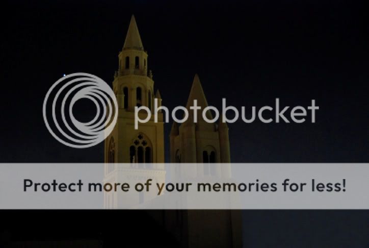
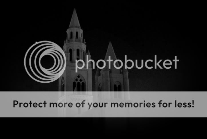
This is the original picture. I wanted to remove the other buildings so that only the church's steeple was the center of attention.

fbcla_original.jpg


Here are the 3 edits below. One in color, B&W, and as for the last one, I totally got rid of the background so only the steeple is standing out.

fbcla_1.jpg


fbcla_2.jpg


fbcla_allblack.jpg


Then I went a little bit further and started messing with some of the preset filter effects that Photoshop has, so in these next pictures I used the "Paint Daubs" artistic filter to paint the photos.

fbcla_pdaubs_before.jpg


fbcla_pdaubs_after.jpg
 
for someone "really new" to Photoshop, i think you did pretty good. the only thing i would change is to try to make the parts you cloned out blend in a little better. in the first edit, on the bottom right corner near the steeple, the yellow from the building looks out of place IMO. its the first thing i look at when i look at that picture.

it says your photos are ok to edit, so i hope you dont mind me having a go with the original.

instead of using the clone too, i just cropped a portion of the sky above each section i removed, resized it to fit, and added a couple additional layers with different opacities to get the right color. once i got that done, i just erased the areas that overlapped onto the steeples. after merging the layers, i noticed a spot on the right side that i missed, so i just cloned a little of the building to fix it. once that was done, i just added a dark vignette. i dont normally care for vignettes much, but i think it helps draw your eyes to the subject of the pictures, and for these, i think it gives them a little more of a "dark" look.

heres the color version.
f641f1cf.jpg


and heres the color with a vignette.
8e8d61dc.jpg


i also did one in black and white, with and without the vignette.

without a vignette.
b3bd3d95.jpg


with a vignette
97c79d2c.jpg
 
for someone "really new" to Photoshop, i think you did pretty good. the only thing i would change is to try to make the parts you cloned out blend in a little better. in the first edit, on the bottom right corner near the steeple, the yellow from the building looks out of place IMO. its the first thing i look at when i look at that picture.
Thanks! Yeah, I've only been using Photoshop for a couple months now on and off. I've been trying to use it everyday so I can get better at it.

I did notice the corner near the steeple that you mentioned. It does kind of stand out. I was trying to blend it in with the background, but I wasn't able to do it precisely to make it look natural.

I like the edits that you made with the color and and the black and white vignette. How do you make (or use) a vignette? I haven't gotten that far yet. It's probably something simple, heh. I also noticed that you left the star in the pictures, whereas, in my pictures, I removed the star. I only removed it because I thought it was kind of blurry.

i didnt know if it was a star or the moon, so i just left it there. i was tempted to add a moon shot to it, but i didnt.

i use PaintShop Pro, so it might be different than Photoshop but for vignettes, i just use one that i have saved or i make a new one.

to make one (with PaintShop Pro X), first duplicate the layer youre working on, choose the elliptical shape tool set to replace and feathered to about 50 and select around the image where you dont want the vignette. then invert the selection and then fill the selected area with the color you want the vignette to be. after that you can set the opacity of the layer to make it look the way you want it. the settings you use, like feathering or the type of selection, can be adjusted to fit the way you want it to look too. the more you feather, the more of a gradient effect youll get. making odd shaped selections will give you the same odd shaped vignette. just try different settings and practice a little, and im sure youll be able to make them the way you like them in no time.

im not sure how that would be done in Photoshop, but i think its probably pretty similiar.
 
A moon shot probably would have been cool! :D

Thanks for the info on creating a vignette. It is actually very similar to how you described.
 

Most reactions

Back
Top