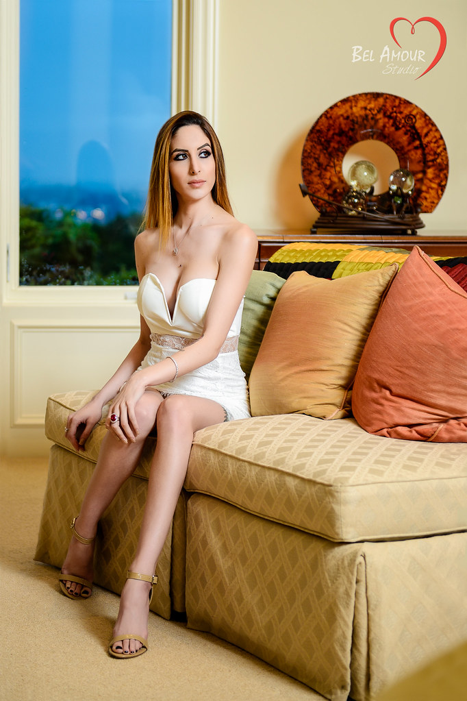
I actually like the direction this is going. Much of your work it seems tits and azz are used to sell the shot (albeit you are exceptionally adept and good at photographing them) this is more subdued and seems the direction or at least closer to a more serious fine art level. Preferable to me personally.
it looks like a standard common pose to me. Something they would use just as well in painting or drawing class with a model. why some don't like this I am not following. I sort of understood the legs too small for the upper torso, which I noticed but didn't think was overwhelmingly detracting. don't even "get" the other dislikes maybe I am just missing the boat here...
I know exactly how you feel! My best feedback on here was an image I nearly trashed for bad comp but liked the lighting.
I'm no professional, but I do like this. I could throw out the whole "there is a line cutting her head in half" generic response, but I like this image. I can't figure out why this set is getting criticized so harshly! It feels like people didn't like the model in the first one, and that has flowed between threads. *shrug* so the model is "apparently too skinny" and this "doesn't make her legs look long enough" does she look GOOD? Yes! Does the background look good? I think so! just my completely worthless two cents. I'll take a refund anytime!
this is a tall girl, with long legs, and unfortunately, this pose does little to accentuate that fact. something with her legs pushed outwards a little more might have given their length a better perspective. pulled back like they are, (and one kinda shadowed) i get the impression that her legs are shorter than they are, and her arms look longer by comparison. overall, it gives her a bit of a "lanky" look. I also think she should be turned a little more to her left, pulling her right arm out from behind her.
I love her expression and her "off in the distance" or "totally indifferent" look.
the lighting is wonderful, and it is framed up nicely.
Wonderful background with nice shapes and colors and really like the pose.The blur in the right corner is a bit distracting and I don't like her leg in the shadow. I would heal out the line on the lower left of the window.

 _POR9544-Edit-2 by WSG Photography, on Flickr
") I really like the white first place, with her in red!!!
I really like the white first place, with her in red!!!
![[No title]](/data/xfmg/thumbnail/34/34081-b60dc01a4635d409083c1fbe16b8fb95.jpg?1619736268)
![[No title]](/data/xfmg/thumbnail/34/34077-2933006a1d00efe7d5967044e94e345e.jpg?1619736268)