kilifila66
TPF Noob!
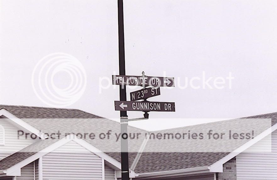
Ok with this pic I was trying to get good symetry between the signs on the post, I wanted the angles to look totally opposite for each. I am not sure if I like my composition with the roof in the background (I can reshoot it if this angle doesn't work.) Any comments, criticisms, or critiques are totally welcome and appreciated.






![[No title]](/data/xfmg/thumbnail/42/42281-7e2c2677bdc791ca1918fb67b6b760c5.jpg?1619740089)
